6 Tips for Tailwind CSS Development (with resources!)

In my previous post, I gave a myriad of reasons why Tailwind CSS is a great option for new and existing projects. When first starting out, it can be daunting to learn every utility class name and know what will fit the situation best in the present and future. This is why, in this post, I will give you tips that I have learned throughout my journey learning Tailwind. These are not rules, but I've found they have made my development easier and more readable.
1. Use 'clsx' to Join Classes
Let's start with something that is highly recommended for every project: using clsx for joining class names. Clsx is a simple JavaScript utility for conditionally joining classes together. It makes our lives easier by giving us syntactic sugar to handle complex styles for CSS solutions like CSS modules, or Tailwind CSS.
💡 This library is the same as Classnames but has a smaller bundle size and better performance.
Its syntax varies depending on the developer's preference and use case. Its syntax can range from arrays to objects. Let's look at all the possibilities:
// EXTRACTED FROM https://github.com/lukeed/clsx
import clsx from "clsx";

// Strings (variadic)
clsx("foo", true && "bar", "baz");
//=> 'foo bar baz'

// Objects
clsx({ foo: true, bar: false, baz: isTrue() });
//=> 'foo baz'

// Objects (variadic)
clsx({ foo: true }, { bar: false }, null, { "--foobar": "hello" });
//=> 'foo --foobar'

// Arrays
clsx(["foo", 0, false, "bar"]);
//=> 'foo bar'

// Arrays (variadic)
clsx(["foo"], ["", 0, false, "bar"], [["baz", [["hello"], "there"]]]);
//=> 'foo bar baz hello there'

// Kitchen sink (with nesting)
clsx(
  "foo",
  [1 && "bar", { baz: false, bat: null }, ["hello", ["world"]]],
  "cya",
);
//=> 'foo bar hello world cya'
This diversity is very powerful and useful when handling complex UIs.
I have chosen two syntaxes for writing Tailwind CSS classes: object notation for handling conditionals and comma-separated values for prefixes.
I first started using the basic string inline evaluation, but soon realized that my classes were ending up crammed. Take a look at this example:
clsx(
  "classes",
  cond1 && "classes classes1 classes2",
  cond2 && cond3 && cond4 && "...",
);
This is considered one of the drawbacks of Tailwind. It can quickly become unreadable and unpleasant to maintain. So I chose JavaScript objects to handle conditional class names.
No matter how many conditions there are, it is easier to read and keep track of. Let's look at the same code as above, but in the new syntax:
clsx("classes", {
  "classes classes1 classes2": cond1,
  "...": cond2 && cond3 && cond4,
});
Immediately one can notice how much easier it is to read, and one can avoid the berated long list of class names.
Furthermore, when working with prefixes like responsive class names and dark mode, we would have:
<div
  class="block bg-white text-left space-y-1 py-2 w-full sm:w-1/2 sm:space-y-0 md:w-1/3 md:space-x-6 dark:bg-gray-700"
/>
My solution to these types of long class names is using comma-separated values in clsx. Like this:
<div
  class={clsx(
    "block bg-white text-left space-y-1 py-2 w-full",
    "sm:w-1/2 sm:space-y-0",
    "md:w-1/3 md:space-x-6",
    "dark:bg-gray-700",
  )}
/>
If needed and you use a code formatter like Prettier, it will send each value to a new line. This, as you may see, makes classes easier to read and modify in the future.
💡If there are few class names like 4 or 5 then I use a plain string since there are no readability improvements otherwise.
You may be asking about the performance loss by using a JavaScript library like clsx. It will affect performance but in a negligible way. The library is so small (311 bytes) and fast that users wouldn't notice any performance difference during runtime.
2. Separate Into Small Components
Tailwind's inline classes allow elements to not rely on the context of implementation. This means styles can be portable — movable through any context without losing meaning.
We should take advantage of it and create as many components as we can. This makes our code more readable by giving it a better composition, and it is easier to maintain in the long run.
Take for example the following snippet:
const Post = ({
  content,
  frontmatter,
  slug,
  nextPost,
  previousPost,
}: Props) => (
    <div className="px-10 pt-40 pb-24 space-y-40 md:pt-48">
      <article className="prose prose-lg xl:prose-2xl">
        <header>
          <h1 className="text-center">
            {frontmatter.title}
          </h1>
          <Image
            className="rounded-lg"
            src={frontmatter.cover_image}
            alt="cover image"
          />
        </header>
        <ReactMarkdown
          escapeHtml={false}
          source={content}
          renderers={{
            code: CodeBlock,
            inlineCode: InlineCode,
            image: InlineImage,
          }}
        />
      </article>
      <hr className="max-w-4xl mx-auto text-center border-black mb-20"/>
      <section className="flex flex-col items-center mx-auto space-y-20">
        <header>
          <h1 className="text-5xl font-bold">You may also like</h1>
        </header>
        <div className="flex flex-col space-y-10 sm:flex-row sm:space-y-0 sm:space-x-20">
          {previousPost && <RecommendedPostCard post={previousPost} />}
          {nextPost && <RecommendedPostCard post={nextPost} />}
        </div>
      </section>
      <hr className="max-w-4xl mx-auto text-center bg-black border-black" />
      <Subscribe className="w-full p-0 mx-auto" />
    </div>
);
When you read this for the first time, you may not even know what each element is doing, aside from those that have specific names already like ReactMarkdown and Image.
Since our styles do not rely on the context, we can create new smaller components that will make it a lot easier to reason about our code.
const Post = ({
  content,
  frontmatter,
  slug,
  nextPost,
  previousPost,
}) => (
    <div className="px-10 pt-40 pb-24 space-y-40 md:pt-48">
      <article className="prose prose-lg xl:prose-2xl">
        <PostHeader frontmatter={frontmatter} />
        <ReactMarkdown
          escapeHtml={false}
          source={content}
          renderers={{
            code: CodeBlock,
            inlineCode: InlineCode,
            image: InlineImage,
          }}
        />
      </article>
      <Divider className="mb-20" />

      <RecommendedPosts previousPost={previousPost} nextPost={nextPost} />

      <Divider className="bg-black" />
      <Subscribe
        vertical
        showLottie={false}
        className="w-full p-0 mx-auto"
      />
    </div>
);

const PostHeader = ({ frontmatter }) => (
  <header>
    <h1 className="text-center">
      {frontmatter.title}
    </h1>
    <Image
      className="rounded-lg"
      src={frontmatter.cover_image}
      alt="cover image"
    />
  </header>
);

const RecommendedPosts = ({
  previousPost,
  nextPost,
}) => (
  <section className="flex flex-col items-center mx-auto space-y-20">
    <header>
      <h1 className="text-5xl font-bold">You may also like</h1>
    </header>
    <div className="flex flex-col space-y-10 sm:flex-row sm:space-y-0 sm:space-x-20">
      {previousPost && <RecommendedPostCard post={previousPost} />}
      {nextPost && <RecommendedPostCard post={nextPost} />}
    </div>
  </section>
);

const Divider: React.FC<DividerProps> = ({ className, ...other }) => (
  <hr className={clsx("max-w-4xl mx-auto text-center border-black", className)} {...other} />
);
By separating these components, we can be sure that our code will be easily read and have better composition.
Furthermore, modifying one of these components will be effortless in the future. Each one has a purpose and is isolated from extraneous logic. This means that developers can be sure they are modifying a specific element and are not affecting other features.
As a rule of thumb, every piece of elements that have constituted a specific role in the website can be separated into a component. This includes sections, navigation, cards, buttons, and even the page itself.
This does not mean that everything should be put in a component. It is best to look for those that will improve readability.
As long as you can't read your code like a normal book or article, it probably means you can benefit from the separation. While this is highly subjective, a way to objectively identify it is by looking for duplicate class names and their role on the site.
For example, the two <hr /> in the non-refactored Page component have nearly identical classes. Their only difference was an mb-20 class name in the first tag and bg-black in the second.
<hr className="max-w-4xl mx-auto text-center border-black mb-20"/>
// ...
<hr className="max-w-4xl mx-auto text-center border-black bg-black" />
So, to avoid repetition we created a component and sent the className prop to extend the classes.
const Divider: React.FC<DividerProps> = ({ className, ...other }) => (
  <hr className={clsx("max-w-4xl mx-auto text-center border-black", className)} {...other} />
);
3. Get VS Code Extensions
Since Tailwind CSS is so predictable, it opens a world of possibilities for extensions that improve development productivity and lower the learning curve.
Here are my five favorites:
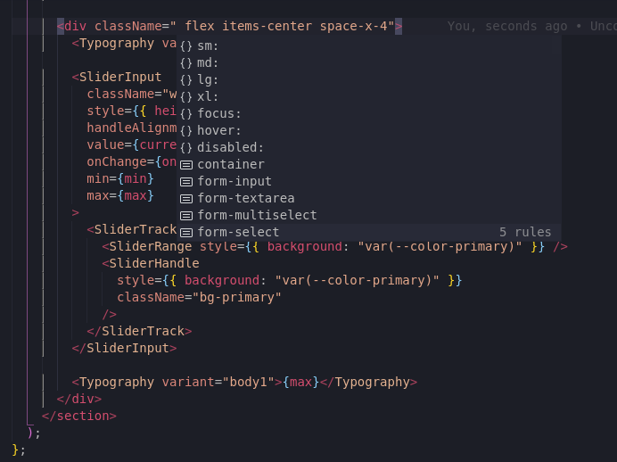
Tailwind CSS IntelliSense
Tailwind CSS IntelliSense greatly improves the Tailwind development experience by providing advanced features like autocomplete, syntax highlighting, and linting.
I believe this is a must-have. It's very useful for learning Tailwind and remembering class names.
Further, it can read your tailwind.config.js and adapt to its values. This is very helpful when adding color, or an official plugin.
Refactor CSS
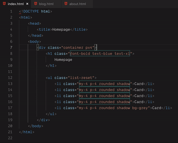
Refactor CSS is a neat extension that lets you identify recurring CSS class names in markup. This is an excellent indicator for knowing when to create a component.
Headwind
This one is huge. Headwind is an opinionated class sorter for Tailwind CSS. It enforces a specific order of classes. It creates a seamless organization in your components that is noticeable right away. In my opinion, it's a must-have.

💡 Recently, a new prettier plugin came out for sorting Tailwind classes. It is best to keep an eye on it and try it if you can. It is perfect for enforcing class order for teammates that use other editors or don't have the extension.
Tailwind Shades
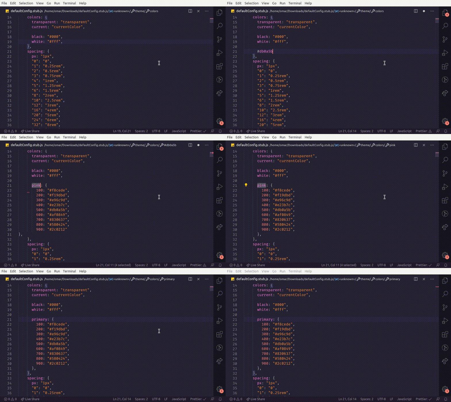
Sometimes it is very useful to generate different shades for a specific HEX color. Tailwind Shades allows you to do so quickly and right within your editor.
Tailwind Docs
Tailwind Docs is a tool that makes Tailwind CSS documentation available on the command palette. This is very useful when one needs to remember a concept or is learning the framework. It also makes you avoid having to search on Google for the documentation link.

4. Rely on Plugins
It is no surprise that Tailwind CSS is extensible. Plugins help developers register new styles for Tailwind CSS through JavaScript.
One could go down a rabbit hole on what it is possible through plugins. But, in short, they are useful for teams looking to share their styles through the organization or for developers who wish to generate class names for complex use cases like animations.
Not only can plugins be created for personal or organizational reasons, but also the community creates very useful plugins that make the developer's life a lot easier.
Here are some of the best plugins you can use for speeding up your development:
Tailwind Forms
Tailwind Forms is a plugin developed by the official team of Tailwind CSS. It provides a style reset for form elements, making it easier to override its styles. This one is a must if one is creating custom forms.

Tailwind Typography
Tailwind Typography is another high-quality plugin developed by the Tailwind team. It provides a set of classes that add typographic defaults as Typography.js does.
It's necessary to style any HTML elements one can't control like, for example, those generated from Markdown.
This one is a must for developing websites that consume a CMS and generate elements through a parser.

💡 I use this plugin on my nextjs-starter-blog template. Check it out if you want or need to start a blog!
Tailwind CSS Debug Screens
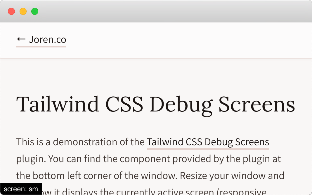
Tailwind CSS Debug Screens is a small neat utility that shows the currently active responsive breakpoint. It is very useful when making layouts since one does not have to go to development tools to see current dimensions.
Tailwind CSS Theming
Tailwind CSS Theming is a plugin that solves the problem of multiple themes within Tailwind. It's perfect for applications that rely on CSS variables to change themes dynamically. I highly recommend this plugin if your project has more than one theme or needs a quick solution for handling themes.
Its main benefit is its readable and straightforward syntax.
// Extracted from:
// https://github.com/innocenzi/tailwindcss-theming/blob/master/docs/quick-start.md
// theme.config.js

const { ThemeManager, Theme } = require("tailwindcss-theming/api");

const base = new Theme().addColors({
  brand: "#44b3ac", // Your brand color
  "on-brand": "#ffffff", // For everything that goes on your brand color
  background: "#f7fafc", // A background color
  "on-background": "#1a202c", // For everything that goes on your background color
});

const dark = new Theme().addColors({
  brand: "#44b3ac", // Your brand color
  "on-brand": "#ffffff", // For everything that goes on your brand color
  background: "#1c1e26", // A background color
  "on-background": "#d5d8da", // For everything that goes on your background color
});

module.exports = new ThemeManager()
  .setDefaultTheme(base) // Sets the `base` theme as the default theme.
  .setDefaultDarkTheme(dark); // Sets the `dark` theme as the default theme for users that prefer the `dark` scheme.
5. Use Pre-Built Components
Since separating into small components is so easy in Tailwind, it is no surprise that its community has created a lot of beautiful component abstractions with it. There are even websites dedicated to this.
Here are some websites or libraries you can use to get pre-built components:
Tailwindcomponents
Tailwindcomponents is a free repository of open source components created by the community. This website is a gem because one can find pretty much anything one needs.
Everyone can submit their components and help other developers in building or learning layouts with Tailwind. Even Adam Wathan, the creator of Tailwind, submits layouts!

Tailwind Toolbox
Tailwind Toolbox is similar to Tailwindcomponents. It has many useful components and additional templates, plugins, tools, and generators. However, it only allows users to suggest resources and not upload their own. This means that content will not be as diverse and abundant as Tailwindcomponents, but it's very useful nonetheless.

Tailwind UI
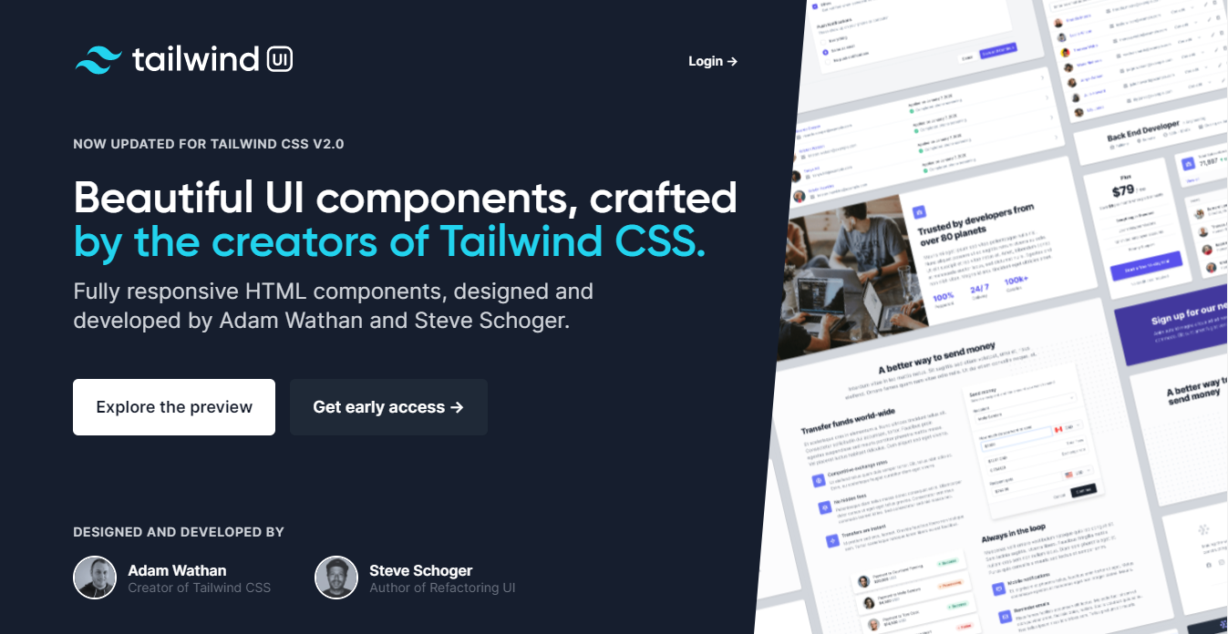
Tailwind UI is a beautiful UI library created by Adam Wathan, and Steve Schoger, author of Refactoring UI. It contains a lot of components, albeit mostly behind a paywall. Nevertheless, the free samples are very high quality and can be useful to give an idea of how to implement a UI.
Tailblocks
Tailblocks is a website that contains common layouts done with Tailwind CSS. They are very useful for kicking off a website quickly.

Gust UI
Gust UI is a very simple component library built with Tailwind. I recommend this site if you need to get some quick React logic for common components like Sliders, Toggles, etc.

Meraki UI
Meraki UI is a Tailwind component library similar to Tailwind UI. It features common layouts and components for common use cases like authentication, navigation, footer, etc. It is worth checking out, especially since it's completely free.

Reach UI
Reach UI is a lifesaver for developers looking to create an accessible design system without dealing with the hassle of creating each component by hand. While these components are not made with Tailwind, they are open to being styled by it because of its granularity.
Its only disadvantage is that its styles must be overridden through an external stylesheet or by setting global important in Tailwind's config. Nevertheless, these can save a lot of time.

6. Use Other Styling Solutions
While this may seem counterproductive given how Tailwind CSS is a solution itself, using another one like CSS Modules or Styled Components is recommended to handle the heavy lifting. 90% of the time you should be using Tailwind, but any complex animation or new property is better handled through the former.
For example, let's say we want to set a max-width for a special component for a specific blog post. We wouldn't like to create a Tailwind class just for one use case, and inline objects may be off the charts because of preference.
Pairing up CSS Modules and Tailwind can solve this conundrum, since one can write Tailwind classes right alongside CSS properties. This makes it extremely powerful and makes stylesheets simpler and easier to maintain.
.root {
  @apply h-full bg-primary mx-auto transition-colors duration-150;

  max-width: 590px;
}

// Called in our code as:
import s from "./styles.module.css"

<section className={s.root}></section>
Another popular way of pairing up Tailwind is through a CSS-in-JS library like Styled Components. Recently, a library called twin.macro has received a lot of hype between developers. It allows developers to integrate Tailwind on an existing codebase with a CSS-in-JS library. This means it has all the benefits of CSS-in-JS: low build times, JavaScript integration, etc. Its syntax looks like this:
import tw, { styled } from "twin.macro";

const Input = styled.input`
  color: purple;
  ${tw`border rounded`}
`;

const Component = () => <Input />;
Check it out if you love CSS-in-JS and like to start having some of the benefits of Tailwind CSS.
Conclusion
Tailwind is an amazing CSS framework, and I expect to keep using it in the foreseeable future. By using these tips, I've found that my codebases are easy to read and seamless to maintain. I hope these were useful to you. If there is any tip or resource you think is relevant for this post, please leave it in the comments down below.
For more up-to-date web development content, follow me on Twitter, and Dev.to! Thanks for reading! 😎

