Logo

Create Mobile-Friendly Navigation with React

cover image

This post is a continuation of my previous post about the reasons why we, developers, should implement a friendly navigation experience for mobile users.

In this post we will be learning how to build mobile-friendly navigation, applying what we learned.

I'll be using React.js since it is a popular and easy to use library. I will make it as straightforward as possible so you can use it in your favorite framework or vanilla.

The next initial steps consist of creating a new React project with Create React App. You can skip this if you already know how to or you can use a sandbox template. Skip the setup.

Creating our workspace

To start immediately and without hassle let's create a Create React App using its CLI:

npx create-react-app mobile-navigation

Now, go to our newly created React build:

cd mobile-navigation

Next, let's install Styled Components to style our components directly in the file. Don't feel pressured to use styled-components; you can use your preferred styling solution.

// npm
npm install --save styled-components

//yarn
yarn add styled-components

Finally, let's start our project:

yarn start

you should see something like this:

Initial React screen

Great!! now we can start working with our app

Setting up our development environment

First, we will delete these files which are irrelevant for our project: index.css, logo.svg, App.css, App.test.js, setupTests.js, and serviceWorker.js.

Now, let's change index.js to this:

import React from "react";
import ReactDOM from "react-dom";
import App from "./App";

ReactDOM.render(
  <React.StrictMode>
    <App />
  </React.StrictMode>,
  document.getElementById("root")
);

And, App.js to this:

import React from "react";
import styled, { createGlobalStyle } from "styled-components";

function App() {
  return (
    <Styles.Wrapper>
      <CSSReset />
    </Styles.Wrapper>
  );
}

const Styles = {
  Wrapper: styled.main`
    display: flex;
    background-color: #eeeeee;
    height: 100vh;
  `,
};

const CSSReset = createGlobalStyle`
  *,
  *::before, 
  *::after {
    margin: 0; 
    padding: 0;
    box-sizing: inherit;
  }

  html {
    font-size: 62.5%; /*1rem = 10px*/
    box-sizing: border-box;    
  }  

  body {
    font-size: 1.4rem;
    font-family: sans-serif;  
  }
`;

export default App;

Here we deleted the initial content and created a global style that normalizes our CSS (make browsers render all elements consistently and in line with current standards) and a wrapper for our future navbar.

Creating the Navbar

Since that we have set up our development environment we can finally start creating our navbar.

Let's say we are creating a navbar for a blog website. It will have 3 main routes: Home, Blog, and About.

First, let's create its HTML:

// ...

function App() {
  return (
    <Styles.Wrapper>
      <CSSReset />

      <Navbar.Wrapper>
        <Navbar.Logo>Logo</Navbar.Logo>
        <Navbar.Items>
          <Navbar.Item>Home</Navbar.Item>
          <Navbar.Item>Blog</Navbar.Item>
          <Navbar.Item>About</Navbar.Item>
        </Navbar.Items>
      </Navbar.Wrapper>
    </Styles.Wrapper>
  );
}

// ...

const Navbar = {
  Wrapper: styled.nav``,
  Items: styled.ul``,
  Item: styled.li``,
};

// ...

And some basic styling:

// ...

const Navbar = {
  Wrapper: styled.nav`
    flex: 1;

    align-self: flex-start;

    padding: 1rem 3rem;

    display: flex;
    justify-content: space-between;
    align-items: center;

    background-color: white;
  `,
  Logo: styled.h1`
    border: 1px solid gray;
    padding: 0.5rem 1rem;
  `,
  Items: styled.ul`
    display: flex;
    list-style: none;
  `,
  Item: styled.li`
    padding: 0 1rem;
    cursor: pointer;
  `,
};

// ...

We now have something like this:

Normal navbar

Making it responsive

To create a mobile-friendly responsive experience we will have to move the navbar to the bottom of the screen so it can be easily reachable with the thumbs. We can go three ways about this:

  1. Create a normal tab bar with conditional rendering.
  2. Move the navbar to the bottom and hide all items in a hamburger button.
  3. Create a hybrid between 1 and 2.

All approaches favor thumb-driven design. Choosing one depends on what situation you are in. Choose 1, if you don't have many items and have the liberty of using a framework, or library. Choose 2, if you are creating a pure vanilla site, and have too many items to put in a tab bar. (caveat: since all elements are hidden users most likely won't find relevant routes). Finally, choose 3, if you have a lot of navigation elements and need some of the most important ones visible to the users.

For the sake of the tutorial, I will recreate the first two approaches (skipping third because we don't have that many navigation elements, however by reading the two approaches, you can mix them and come up with it).

First Approach: Creating a Normal Tab Bar

To get started with this approach we need to detect the current width of the screen so we can render the tab bar whenever we are on mobile. To do this we can use window.innerWidth, however, since we want to mimic CSS, which changes anytime the user resizes, we need to create an event listener which watches for the resize event:

// App.js

import React, { useEffect, useState } from "react";

// ...

function App() {
  const [windowDimension, setWindowDimension] = useState(null);

  useEffect(() => {
    setWindowDimension(window.innerWidth);
  }, []);

  useEffect(() => {
    function handleResize() {
      setWindowDimension(window.innerWidth);
    }

    window.addEventListener("resize", handleResize);
    return () => window.removeEventListener("resize", handleResize);
  }, []);

  const isMobile = windowDimension <= 640;

 // ...

In production, debouncing the handleResize would be a good idea.

Now that we know when the user is on mobile, we can move to create the skeleton of the mobile nav:

// ...

function App() {
  // ...

  return (
    <Styles.Wrapper>
      <CSSReset />

      {isMobile ? (
        <MobileNavbar.Wrapper>
          <MobileNavbar.Items>
            <MobileNavbar.Item>Home</MobileNavbar.Item>
            <MobileNavbar.Item>Blog</MobileNavbar.Item>
            <MobileNavbar.Item>About</MobileNavbar.Item>
          </MobileNavbar.Items>
        </MobileNavbar.Wrapper>
      ) : (
        <Navbar.Wrapper>
          <Navbar.Logo>Logo</Navbar.Logo>
          <Navbar.Items>
            <Navbar.Item>Home</Navbar.Item>
            <Navbar.Item>Blog</Navbar.Item>
            <Navbar.Item>About</Navbar.Item>
          </Navbar.Items>
        </Navbar.Wrapper>
      )}
    </Styles.Wrapper>
  );
}

// ...

const MobileNavbar = {
  Wrapper: styled(Navbar.Wrapper)``,
  Items: styled(Navbar.Items)``,
  Item: styled(Navbar.Item)``,
};

// ...

By reusing some of the styles from our Navbar we can save up some redundant CSS. Let's style the mobile navigation to fit our needs:

// ...

const MobileNavbar = {
  Wrapper: styled(Navbar.Wrapper)`
    position: fixed;
    width: 100vw;
    bottom: 0;

    justify-content: center;
  `,
  Items: styled(Navbar.Items)`
    flex: 1;
    padding: 0 2rem;

    justify-content: space-around;
  `,
  Item: styled(Navbar.Item)``,
};

// ...

When we resize we should see our new navigation bar.

Tab bar

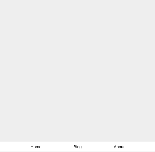
Congratulations! We've created mobile-friendly navigation.

Bonus!

To make it more like a mobile navbar we could add some SVG icons. Add the next dependency.

  yarn add react-feather

Let's import our icons and create a wrapper for it:

// ...
import { Home, Bookmark, User } from "react-feather";

function App() {
  // ...

  return (
    <Styles.Wrapper>
      <CSSReset />

      {isMobile ? (
        <MobileNavbar.Wrapper>
          <MobileNavbar.Items>
            <MobileNavbar.Item>
              <MobileNavbar.Icon>
                <Home size={16} />
              </MobileNavbar.Icon>
              Home
            </MobileNavbar.Item>
            <MobileNavbar.Item>
              <MobileNavbar.Icon>
                <Bookmark size={16} />
              </MobileNavbar.Icon>
              Blog
            </MobileNavbar.Item>
            <MobileNavbar.Item>
              <MobileNavbar.Icon>
                <User size={16} />
              </MobileNavbar.Icon>
              About
            </MobileNavbar.Item>
          </MobileNavbar.Items>
        </MobileNavbar.Wrapper>
      ) : (
        <Navbar.Wrapper>
          <Navbar.Logo>Logo</Navbar.Logo>
          <Navbar.Items>
            <Navbar.Item>Home</Navbar.Item>
            <Navbar.Item>Blog</Navbar.Item>
            <Navbar.Item>About</Navbar.Item>
          </Navbar.Items>
        </Navbar.Wrapper>
      )}
    </Styles.Wrapper>
  );
}

// ...

const MobileNavbar = {
  Wrapper: styled(Navbar.Wrapper)``,
  Items: styled(Navbar.Items)``,
  Item: styled(Navbar.Item)``,
  Icon: styled.span``,
};

// ...

Finally, add some styles:

// ...

const MobileNavbar = {
  Wrapper: styled(Navbar.Wrapper)`
    align-self: flex-end;

    justify-content: center;
  `,
  Items: styled(Navbar.Items)`
    flex: 1;
    padding: 0 2rem;

    justify-content: space-around;
  `,
  Item: styled(Navbar.Item)`
    display: flex;
    flex-direction: column;
    align-items: center;

    font-size: 1.2rem;
  `,
  Icon: styled.span``,
};

// ...

Tab bar with svg icons

And that's it! we have our new tab bar which is closer to what we are used to seeing in mobile apps.

This is our final product:

Second Approach: Creating navigation with Hamburger Button

To get started with this approach we must move the navbar to the button. With media queries we can accomplish this quickly:

const Navbar = {
  Wrapper: styled.nav`
    flex: 1;

    align-self: flex-start;

    padding: 1rem 3rem;

    display: flex;
    justify-content: space-between;
    align-items: center;

    background-color: white;

    // 40em == 640px
    @media only screen and (max-width: 40em) {
      position: fixed;
      width: 100vw;
      bottom: 0;
    }
  `,
  // ...
};

Let's create our hamburger button. First, it's HTML:

// ...

function App() {
  return (
    <Styles.Wrapper>
      <CSSReset />

      <Navbar.Wrapper>
        <Navbar.Logo>Logo</Navbar.Logo>

        <HamburgerButton.Wrapper>
          <HamburgerButton.Lines />
        </HamburgerButton.Wrapper>

        <Navbar.Items>
          <Navbar.Item>Home</Navbar.Item>
          <Navbar.Item>Blog</Navbar.Item>
          <Navbar.Item>About</Navbar.Item>
        </Navbar.Items>
      </Navbar.Wrapper>
    </Styles.Wrapper>
  );
}

// ...

const HamburgerButton = {
  Wrapper: styled.div``,
  Button: styled.div``,
};

// ...

And, its styles:

// ...

const HamburgerButton = {
  Wrapper: styled.button`
    height: 3rem;
    width: 3rem;
    position: relative;
    font-size: 12px;

    display: none;

    @media only screen and (max-width: 40em) {
      display: block;
    }

    /* Remove default button styles */
    border: none;
    background: transparent;
    outline: none;

    cursor: pointer;

    &:after {
      content: "";
      display: block;
      position: absolute;
      height: 150%;
      width: 150%;
      top: -25%;
      left: -25%;
    }
  `,
  Lines: styled.div`
    top: 50%;
    margin-top: -0.125em;

    &,
    &:after,
    &:before {
      height: 2px;
      pointer-events: none;
      display: block;
      content: "";
      width: 100%;
      background-color: black;
      position: absolute;
    }

    &:after {
      /* Move bottom line below center line */
      top: -0.8rem;
    }

    &:before {
      /* Move top line on top of center line */
      top: 0.8rem;
    }
  `,
};

// ...

Furthermore, let's convert our items into a drawer:

// ...

const Navbar = {
  // ...

  Items: styled.ul`
    display: flex;
    list-style: none;

    @media only screen and (max-width: 40em) {
      position: fixed;
      right: 0;
      top: 0;

      height: 100%;

      flex-direction: column;

      background-color: white;
      padding: 1rem 2rem;

      transition: 0.2s ease-out;

      transform: translateX(100%);
    }
  `,
  Item: styled.li`
    padding: 0 1rem;
    cursor: pointer;

    @media only screen and (max-width: 40em) {
      padding: 1rem 0;
    }
  `,
};

// ...

Now all that's left is add our logic to open and close our drawer. One thing to look out here is if we add a normal toggle, then, when we open the drawer, we won't be able to close it. One option would be to add a close button, however, since this drawer's width is not the whole screen, the user would expect to be able to close it by clicking outside the drawer. So, we will add a listener that detects outside clicks:

import React, { useState, useEffect } from "react";

// ...

function App() {
  const [openDrawer, toggleDrawer] = useState(false);
  const drawerRef = useRef(null);

  useEffect(() => {
    /* Close the drawer when the user clicks outside of it */
    const closeDrawer = (event) => {
      if (drawerRef.current && drawerRef.current.contains(event.target)) {
        return;
      }

      toggleDrawer(false);
    };

    document.addEventListener("mousedown", closeDrawer);
    return () => document.removeEventListener("mousedown", closeDrawer);
  }, []);

  return (
    <Styles.Wrapper>
      <CSSReset />

      <Navbar.Wrapper>
        <Navbar.Logo>Logo</Navbar.Logo>

        <HamburgerButton.Wrapper onClick={toggle}>
          <HamburgerButton.Lines />
        </HamburgerButton.Wrapper>

        <Navbar.Items ref={drawerRef} openDrawer={openDrawer}>
          <Navbar.Item>Home</Navbar.Item>
          <Navbar.Item>Blog</Navbar.Item>
          <Navbar.Item>About</Navbar.Item>
        </Navbar.Items>
      </Navbar.Wrapper>
    </Styles.Wrapper>
  );
}

// ...

const Navbar = {
  // ...

  Items: styled.ul`
    display: flex;
    list-style: none;

    @media only screen and (max-width: 40em) {
      position: fixed;
      right: 0;
      top: 0;

      height: 100%;

      flex-direction: column;

      background-color: white;
      padding: 1rem 2rem;

      transform: ${({ openDrawer }) =>
        openDrawer ? `translateX(0)` : `translateX(100%)`};
    }
  `,

  // ...
};

Hamburger navigation

Congratulations!! We have our drawer with all our items, now we can rest assured the mobile user will have a better time navigating our site.

This is our final product:

Conclusion

Learning how to create friendly mobile navigation on the browser is really important especially with the growing use of mobile phones. Applying this in production means our users will have a pleasant experience on our website, thus leading to a larger conversion rate.

For more up-to-date web development content, follow me on Twitter, and Dev.to! Thanks for reading! ๐Ÿ˜Ž


You may also like


Front-End novelty in your inbox

My goal is to create easy-to-understand, rich blog posts for Front-End Developers. If you love to learn more about streamlined front-end practices, you'll more likely love what I'm working on! Don't worry, there will not be spam, and you can unsubscribe at any time.

You will also receive awesome weekly resources to stay ahead in web development!

(required)
contactContact Me