
Don't want to code along? See this template on GitHub with even more features such as SEO, and deploy it instantly to Netlify or Zeit Now.
Recently, I had to create a blog for my Next.js personal website and portfolio. I looked online for any solution that could help me develop the blog. However, I could not find any simple solution like you would for Gatsby.js.
This post will try to create a blog similar to Gatsby Starter Blog with Next.js and tailwind.css.
There are many ways of parsing markdown such as using MDX. However, in this post, I'll focus on normal markdown with frontmatter so you can use a CMS like Netlify CMS with it.
Creating a Next.js project
We will create a Next.js app using its CLI. Run one of these commands. This will create an initial layout where we will start developing our blog.
Now run:
Great! We have created our next app. You should be seeing this:
Installing main dependencies
We will be using gray-matter to parse our frontmatter and markdown, react-markdown for converting it to HTML and displaying it, and tailwind.css to streamline styles quickly.
Let's add all necessary dependencies:
Configure Tailwind.css
Thanks to this tutorial, we can get started with Tailwind.css quickly. Initialize it with the next command; it will create our config:
Next, create a file called postcss.config.js to configure Postcss, and add this:
Then, let's create a CSS style sheet on styles/tailwind.css.
Finally, create pages/_app.js and import our newly created style sheet:
Great! Now we can start working on our blog directly.
Configure Purgecss for tailwind (optional)
Adding Purgecss is highly recommended when using tailwind.css or CSS. It automatically removes any unused CSS at build time, which can reduce our bundle size.
First, add the necessary dependency:
Then, update our postcss.config.js
Creating Our Posts
We will be using markdown with jekyll's frontmatter syntax to write our posts. This will help us maintain our posts in a clean and easy to use format.
All our posts will be located in content/posts, so proceed to create this route and add our first post called first-post.md.
Now let's create a second one called second-post.md.
Fetching our posts
Having our initial posts, we can begin to work on our index page. Let's delete whatever we had previously, and start with a clean component:
To get all posts we will use getStaticProps. This method will fetch all our posts and feed it as props to our page.
The main benefit of getStaticProps is its static generation which means the content will be generated at build time, and will not be fetched every time a user visits our blog.
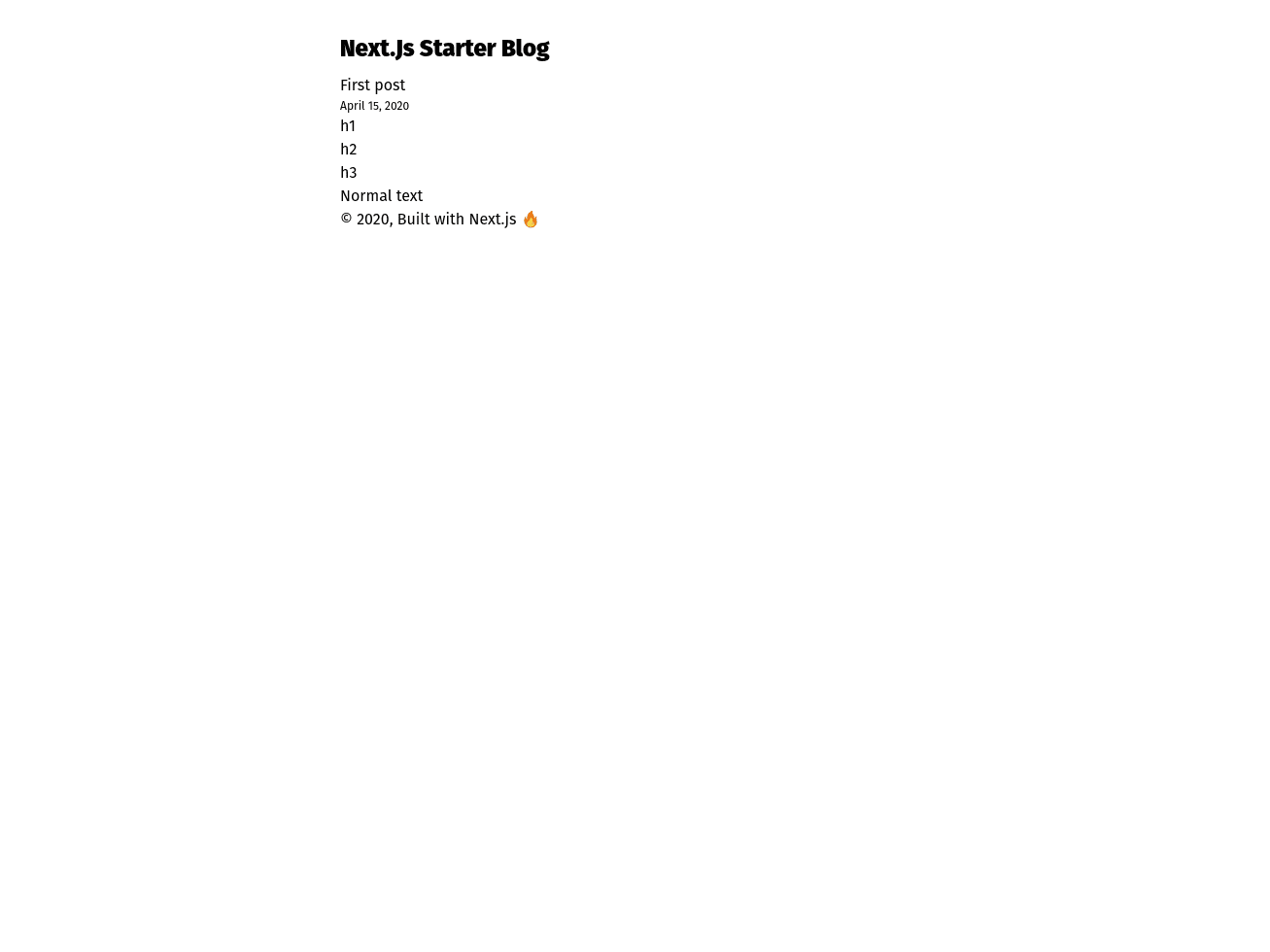
Now you should be seeing this:
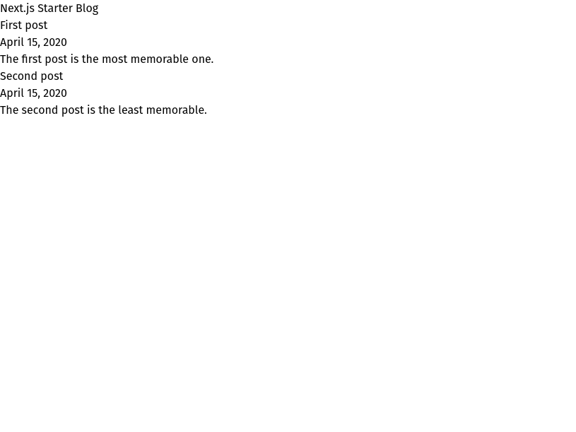
Awesome! We can see all our posts.
Adding Layout component
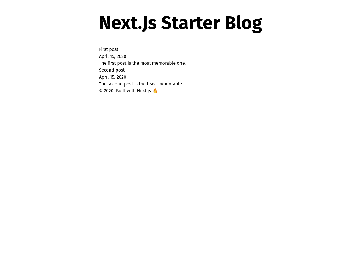
Before we start working on index.js styles, let's first add a layout component that will wrap our pages. Create a components/layout.js and add this:
It should look like this:
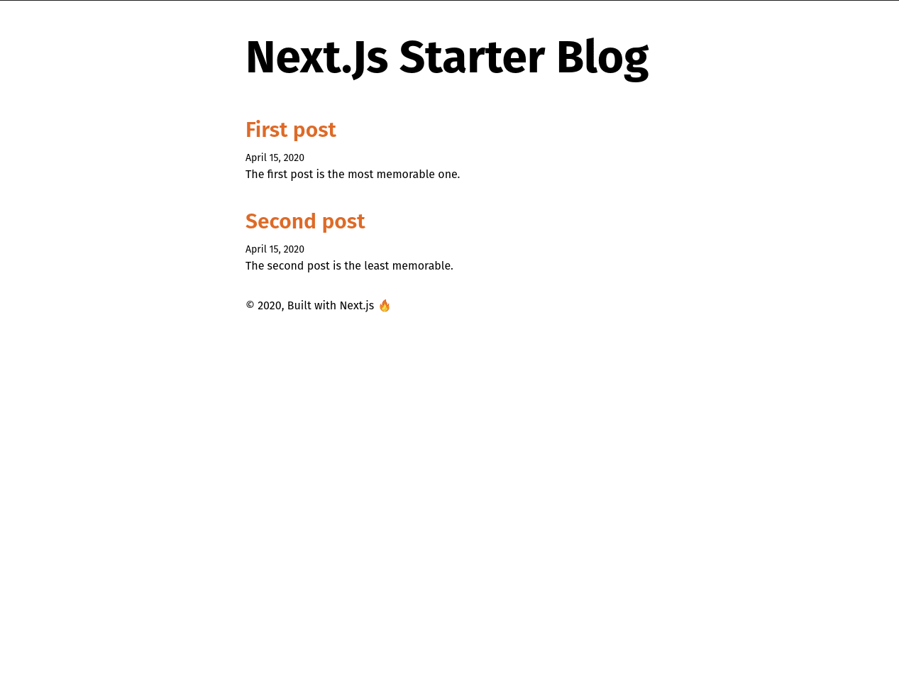
Styling Our Blog's Index Page
Let's style our index page. We won't do anything fancy, but I welcome you to take your time and style it as best as you can.
So, let's start:
Creating Post Page
Right now we have something like this, pretty cool, right?
However, what is the point of a blog if we can't read our posts? So let's get started creating our post page. Go ahead and create pages/post/[slug].js, and add this:
We created what is called a template, basically a blueprint of how our posts should look. That [slug].js format indicates a dynamic route within Next.js, and based on the slug we will render the post we need. Read more on dynamic routes.
Here we used both getStaticProps and getStaticPaths to create our post's dynamic route. The method getStaticPaths allows us to render dynamic routes based on the parameters we provide, in this case, a slug. You may have noticed that we are receiving a params.slug parameter in getStaticProps. This is because getStaticPaths passes the current slug for us to fetch the post we need.
We are providing our Post component both the content and frontmatter of our post. Now, all that is left is to render the markdown with React Markdown. React Markdown's job is to convert our markdown to HTML so we can display it on our site. Add the following to your [slug].js:
Connecting Our Index with Post
Our post template is done, but we have to be able to access it through a link on our page. Let's wrap our post's title with a (Link)[https://nextjs.org/docs/api-reference/next/link] component provided by Next.js on index.js.
Click any of the posts and...
Isn't it beautiful? Well, not quite since our markdown is not being styled yet.
Styling Our Markdown
We could start adding rule by rule in CSS to style all the post's headings and other elements, however, that would be a tedious task. To avoid this, I'll be using Typography.js since it gives us access to more than 20 different themes, and add these styles automatically.
Don't feel pressured to use this solution. There are many ways you can achieve this, feel free to choose whatever works for you best.
First, let's add Typography.js to our dependencies:
I will be using Sutra theme since for me it looks really good and sleek. You can access Typography.js main site and preview all the different themes. Without further ado, let's add it:
You may notice I'm adding some packages which contain local fonts. Typography gives us the option to get our fonts through Google Fonts, nevertheless, I prefer having these fonts locally.
Now that we have the packages we need, create a utils/typography.js to create our main Typography.js configuration:
Then, create pages/_document.js to inject our typography styles.
To import our typeface font go to pages/_app.js and add this line:
Typography.js includes a CSS normalization that will collide with tailwind's. Therefore, let's disable Tailwind's normalization in tailwind.config.js
Now our blog's index page looks sleek:

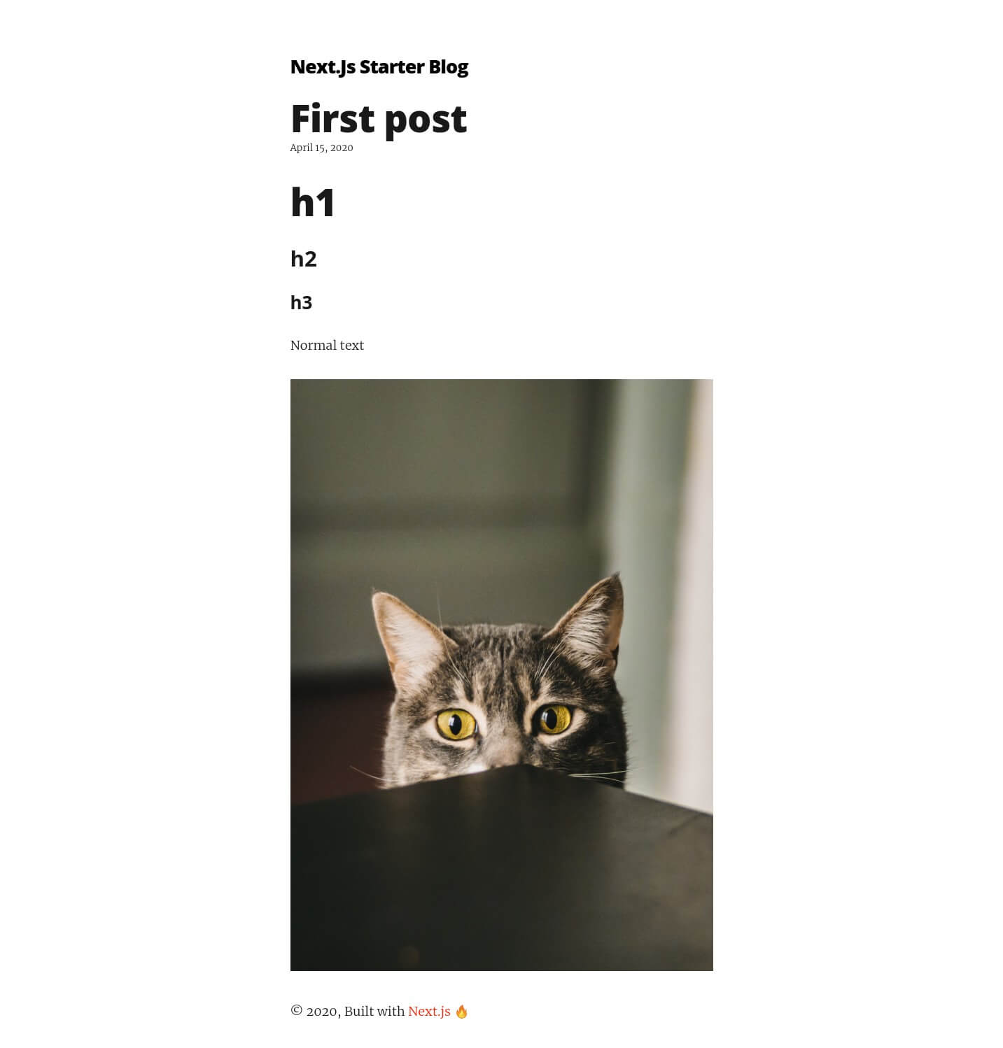
Working With Images
Adding images is very straightforward with our setup. We add our desired image to public. For the sake of this tutorial, I'll add this cute cat picture to my public folder.

Then, in content/posts/first-post:
Notice the forward-slash before cat.jpg. It indicates that it is located in the public folder.
We should have something like this:
That's it!! We have successfully created our static blog. Feel free to take a break, and pat yourself in the back.
(Bonus) Adding Code Blocks
Our current blog works perfectly for non-coding posts. However, if we were to add code blocks, our users will not be able to see them as we expect them to with syntax highlighting.
To add syntax highlighting we will use react-syntax-highlighter and integrate it with react-markdown since the latter won't parse tokens for our code.
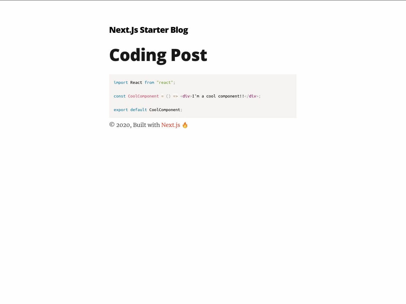
First, let's add a new post in content/posts/coding-post:
Remove the component's backslashes after you copy them, so it can be highlighted.
Then, add react-syntax-highlighter:
Finally, change pages/post/[slug].js to:
Now if we open our coding post, we should see this:
(Bonus) Optimize Our Images
Adding next-optimized-images in our blog will allow us to deliver optimized images in production which makes our site faster.
First, let's add next-optimized-images and next-compose-plugins to our packages:
Then, create next.config.js in the root of our project:
Next Optimized Images uses external packages to optimize specific image formats, so we have to download whichever we need. In this case, I'll optimize JPG and PNG images, therefore I'll use the imagemin-mozjpeg and imagemin-optipng packages. Head to next-optimized-images's github to see which other packages are available.
Furthermore, we will also add lqip-loader to show a low-quality image preview before they load, just like Gatsby.js does.
Once added, next-optimized-images will automatically apply optimizations in production.
Now, let's head to pages/post/[slug].js and add the following:
Finally, change content/posts/first-post.md image route:
With this, we have created a component that will render each time an image is found in our markdown. It will render the preview, and then hide it when our image has loaded.
Conclusion
Next.js is a really powerful and flexible library. There are many alternatives on how to create a blog. Regardless, I hope this has helped you create your own and notice that it is not as hard as it seems.
I created a template of this post (look at it here next-starter-blog GitHub repository), which will be updated soon with more features such as a sitemap, SEO and RSS feed. Stay tuned!


