
Last post addressed the definition, benefits, and application of semantic HTML. In this post, I will walk through the process of coding an accessible, responsive website using what we've learned in the series.
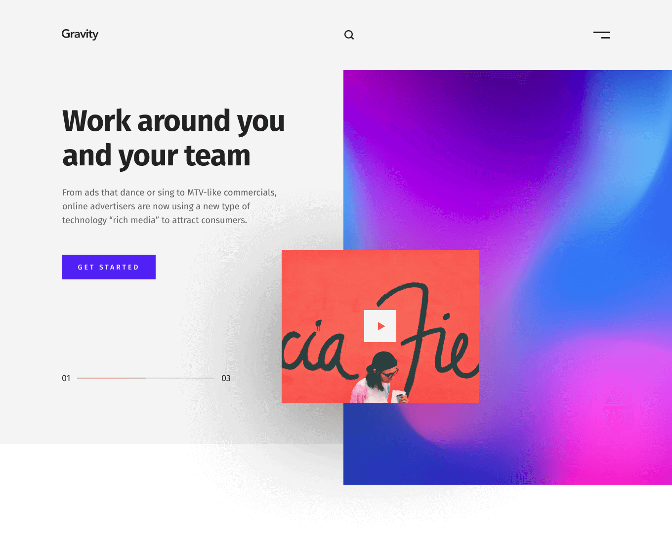
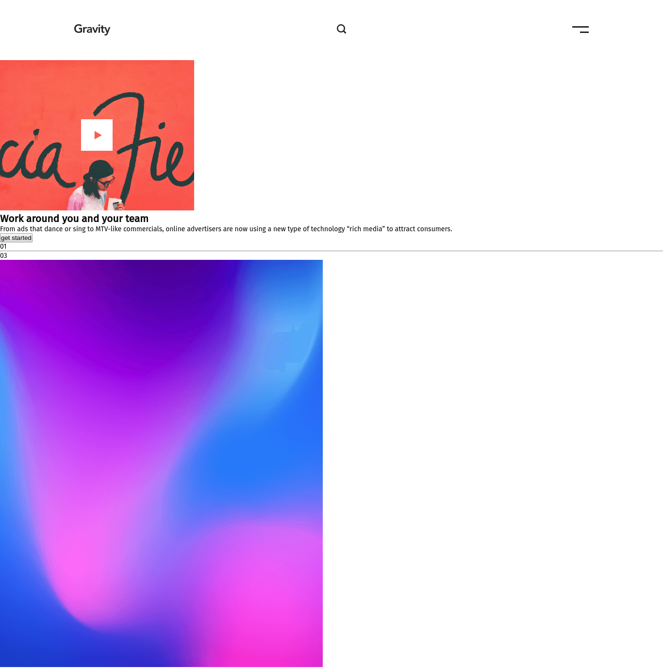
Starting this series, we had the following design:
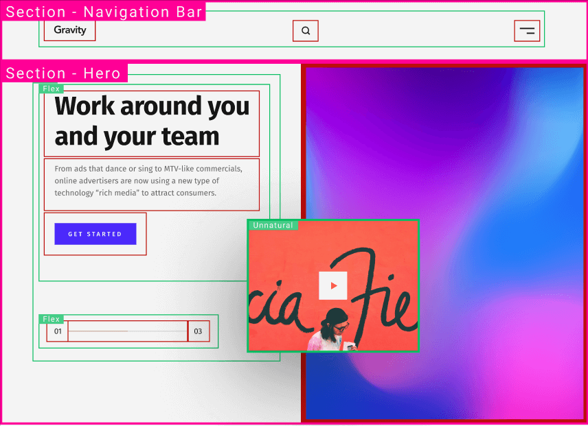
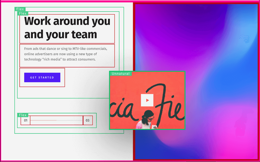
And we created a layout model using a technique learnt on the first post of the series:
Having this, we can begin translating this model to HTML and CSS!
Responsive Design
One more thing before starting, we have to think about how we will make the site responsive. There are two ways we can achieve this:
- Set a max-width to all our sections and focus on the most used breakpoints.
- Make it fluid on all screens.
Note: Every design should aim to be responsive in all screen sizes. However, it can be really time-consuming, therefore we use one of the two methods above to avoid creating media queries for all screens available.
Selecting one of the methods greatly depends on the situation and preference.
Setting a max-width is what I normally go for. The design stays consistent on big screens and is easier to style since there are fewer breakpoints to worry about.
Making it fluid is better for some designs. If implemented well (using grid e.g. 12 column grid) it can be done really quickly and will be responsive in all breakpoints. However, its cost of implementation can be quite high.
For the sake of this tutorial, we will go with the first method. For the breakpoints, we'll be using the most common:
- Mobile (640px)
- Tablet (768px)
- Tablet Landscape (1024px)
- Laptop (1440px)
- Really big screens (>= 2000px)
CSS Normalization
Whenever creating a website, writing CSS that is consistent in all browsers is a must. To guarantee this, we use something called CSS Normalization. Normalize.css is great for this. However, it is overkill for this kind of project. Therefore, we will be using a very basic CSS Normalization, but I highly recommend Normalize.css.
In our basic normalizer, we will just remove browsers added margin and padding. Also, add box-sizing to guarantee a consistent width and height property.
Apart from removing browser's defaults, using rem units instead of px will streamline the process of making the site responsive since each element will grow or decrease based on the user's browser zoom or breakpoints. To achieve this, we will change font-size value to a percent. In this case, 62.5%, so that 1 rem would be equal to 10 pixels. On the other hand, whenever we need the design to stay consistent we can use px units.
Navigation Bar
Let's start with the navbar. The navbar section element is header since it serves as our website's heading containing the site's main links and general brand.
Note: I will be using BEM notation for elements CSS classes since it increases legibility.
Writing the styles for the navigation bar is pretty straightforward once you have the CSS purpose of each block. We can refer to our model:
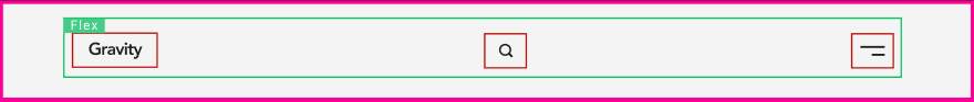
By taking a look, the block uses flex to organize its elements.
Also, it has some padding (more on its right and left than top and bottom). Let's translate this to CSS:

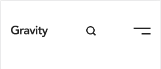
That's all for our navigation bar!
Hero Section
Next, let's write our hero. This time we'll use a section tag as the container since we are defining a group of related content.
You may see that we are using a header inside a section. It is perfectly normal to do this since it indicates that it is the introductory element of that section. Looking back at our navigation bar, it is the introductory element for our document or website.
We'll have something like this. Although semantic and accessible, it lacks beauty and responsiveness.
Styling our hero has a higher complexity than our navigation since it has more elements and blocks. Regardless, using our model we can achieve the pixel-perfect look we want.
It is important to take things one step at a time, looking at each CSS purpose of our model. Likewise, some of the code will be trial and error; it is perfectly fine to do this as long as it gets to look like our intended design.
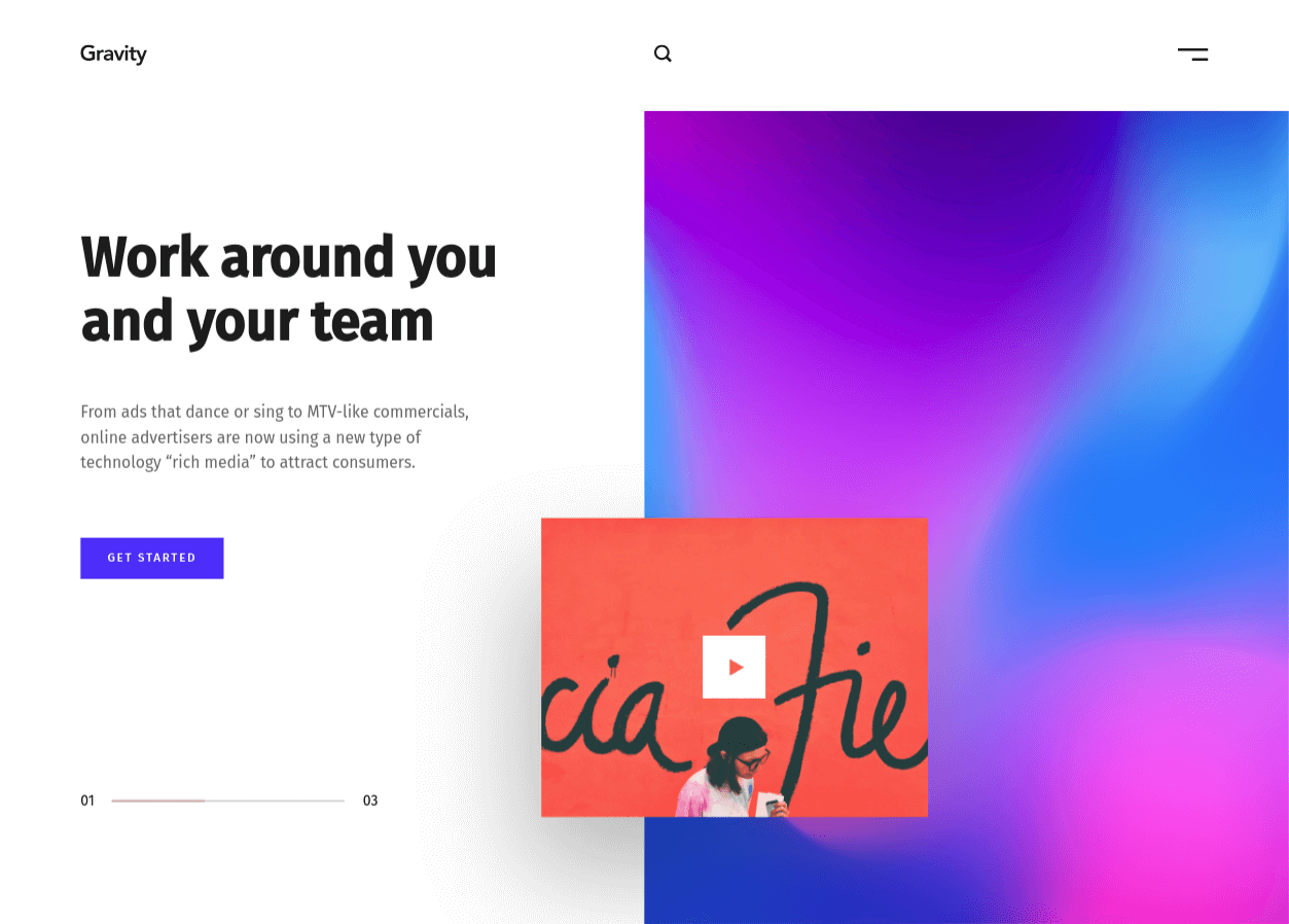
Now we have this!!
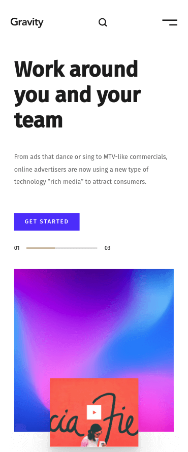
And on mobile:
Note: The mockup didn't have a mobile version, regardless, this is a little extra.
Here is the sandbox if you want to play around with the website.
Conclusion
Creating pixel-perfect layouts is very important for web developers since most websites have a mockup behind them. With layout models and semantic HTML, we can create almost any website with high fidelity while taking care of accessibility and responsiveness.
Thanks for reading this series on how to create Pixel Perfect Layouts 🥳! Feel free to check out the other parts. Follow me on Twitter, and Dev.to! See you soon 🔥💻


