Getting Started with React Animations
Interaction plays a key role in shaping the experience a user has on an application. Animations help define these interactions since the user's eyes tend to pay attention to moving objects. These catchy and moving elements tell a story that helps the application differentiate from competitors and bring a better user experience.
Creating animations can be daunting, especially programming and handling orchestrations (how these coordinate between each other). Thankfully, amazing people have created abstractions in libraries that allow the developer to create seamless, hardware-accelerated animations efficiently.
In this post, I will give an introduction to Framer Motion and create simple animations with it. We'll be learning about motion components, orchestration, dragging, and automatic animations.
React Animation Libraries
In React, we have two main animation libraries: React Spring and Framer Motion. I like both of them, but I believe each one has a use case.
React Spring is a spring-physics based animation library. These animations emulate real spring physics for smooth animations. It is really powerful and flexible. Almost all properties of HTML tags can be fully animated with React Spring. This is especially important for complex and SVG animations. However, its main disadvantage is its high learning curve.
Framer Motion is a motion library. It is easy to learn and powerful with orchestrations. Contrary to React Spring, it has more types of animations: spring, tween, and inertia. Tweens represent duration-based animations like CSS, and inertia decelerates a value based on its initial velocity, usually used to implement inertial scrolling.
Framer Motion is perfect for handling animations on 99% of sites. Its main disadvantage is its lack of documentation and some properties won't work for SVG animations.
Choosing between these libraries depends greatly on what you are building and how much you are willing to devote to learning animations. React Spring can do all that Framer Motion does with more flexibility, but it is harder to read and understand. I recommend it for custom, complex animations especially for SVG and 3D (Three.js).
For most websites, Framer Motion is better since it can handle most common cases and its learning curve is really low compared to React Spring. Also, its way of handling animations is more intuitive and declarative. This is why we'll focus on this library and learn about animations with it. The fundamentals of Framer Motion will be transferable to React Spring. However, its syntax will be more abstract.
How It Works: Motion components
Framer Motion's core API is the motion component. There's a motion component for every HTML and SVG element. They work exactly the same as their HTML counterparts but have extra props that declaratively allow adding animations and gestures.
Think of the motion component as a big JavaScript object that can be used to access all HTML elements. Here are some ways one would call a motion component:
<motion.div />
<motion.span />
<motion.h1 />
<motion.svg />
...
As said before, they allow for extra props. Some of the most used are:
initialdefines the initial state of an element.styledefines style properties just like normal React elements, but any change in the values through motion values (values that track the state and the velocity of the component) will be animated.animatedefines the animation on the component mount. If its values are different fromstyleorinitial, it will automatically animate these values. To disable mount animationsinitialhas to be set tofalse.exitdefines the animation when the component unmounts. This works only when the component is a child of the<AnimatePresence />component.transitionallows us to change animation properties. Here one can modify the duration, easing, type of animation (spring, tween, and inertia), duration, and many other properties.variantsallows orchestrating animations between components.
Now that we know the basic props that motion can contain and how to declare them, we can proceed to create a simple animation.
Mount Animations
Let's say we want to create an element that on mount will fade in down. We would use the initial and animate prop.
Inside the initial property, we'll be declaring where the component should be located before it mounts. We'll be adding an opacity: 0 and y: -50. This means the component initially will be hidden and will be 50 pixels up from its location.
In the animate prop, we have to declare how the component should look when it is mounted or shown to the user. We want it to be visible and located on its initial position, so we'll add an opacity: 1 and y: 0.
Framer Motion will automatically detect that the initial prop has a different value from the animate prop, and animate any difference in properties.
Our snippet will look like this:
import { motion } from "framer-motion";

<motion.div initial={{ opacity: 0, y: -50 }} animate={{ opacity: 1, y: 0 }}>
  Hello World!
</motion.div>;
This will create the following animation:
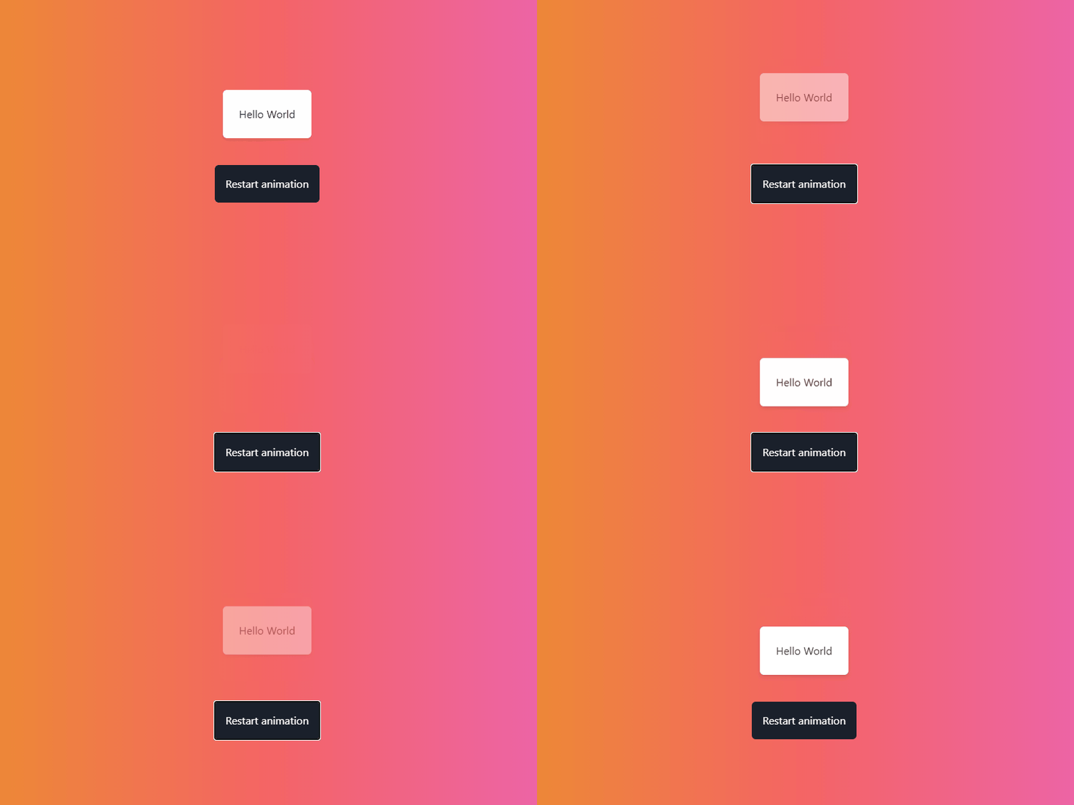
Congratulations on creating your first animation with Framer Motion!
💡 You may have noticed that styles are missing from the snippets above. Some of the snippets will lack the styles in order to focus on Framer Motion's functionality.
📕 All animations in this post will have their own Storybook. Here is the link of the latter.
Unmount Animations
Unmounting or exit animations are crucial when creating dynamic UIs, especially when deleting an item or handling page transitions.
To handle exit animations in Framer Motion, the first step is to wrap the element or elements in an <AnimatePresence/>. This has to be done because:
- There is no lifecycle method that communicates when a component is going to be unmounted
- There is no way to defer unmounting until an animation is complete.
AnimatePresence handles all this automatically for us.
Once the elements are wrapped, they must be given an exit prop specifying their new state. Just like animate detects a difference in values in initial, exit will detect the changes in animate and animate them accordingly.
Let's put this into practice! If we take the previous component and were to add an exit animation, we want it to exit with the same properties as it did in initial
import { motion } from "framer-motion";

<motion.div
  exit={{ opacity: 0, y: -50 }}
  initial={{ opacity: 0, y: -50 }}
  animate={{ opacity: 1, y: 0 }}
>
  Hello World!
</motion.div>;
Now, let's add a <AnimatePresence/> so it can detect when our component unmounts:
import { motion } from "framer-motion";

<AnimatePresence>
  <motion.div
    exit={{ opacity: 0, y: -50 }}
    initial={{ opacity: 0, y: -50 }}
    animate={{ opacity: 1, y: 0 }}
  >
    Hello World!
  </motion.div>
</AnimatePresence>;
Let's see what happens when the component unmounts:
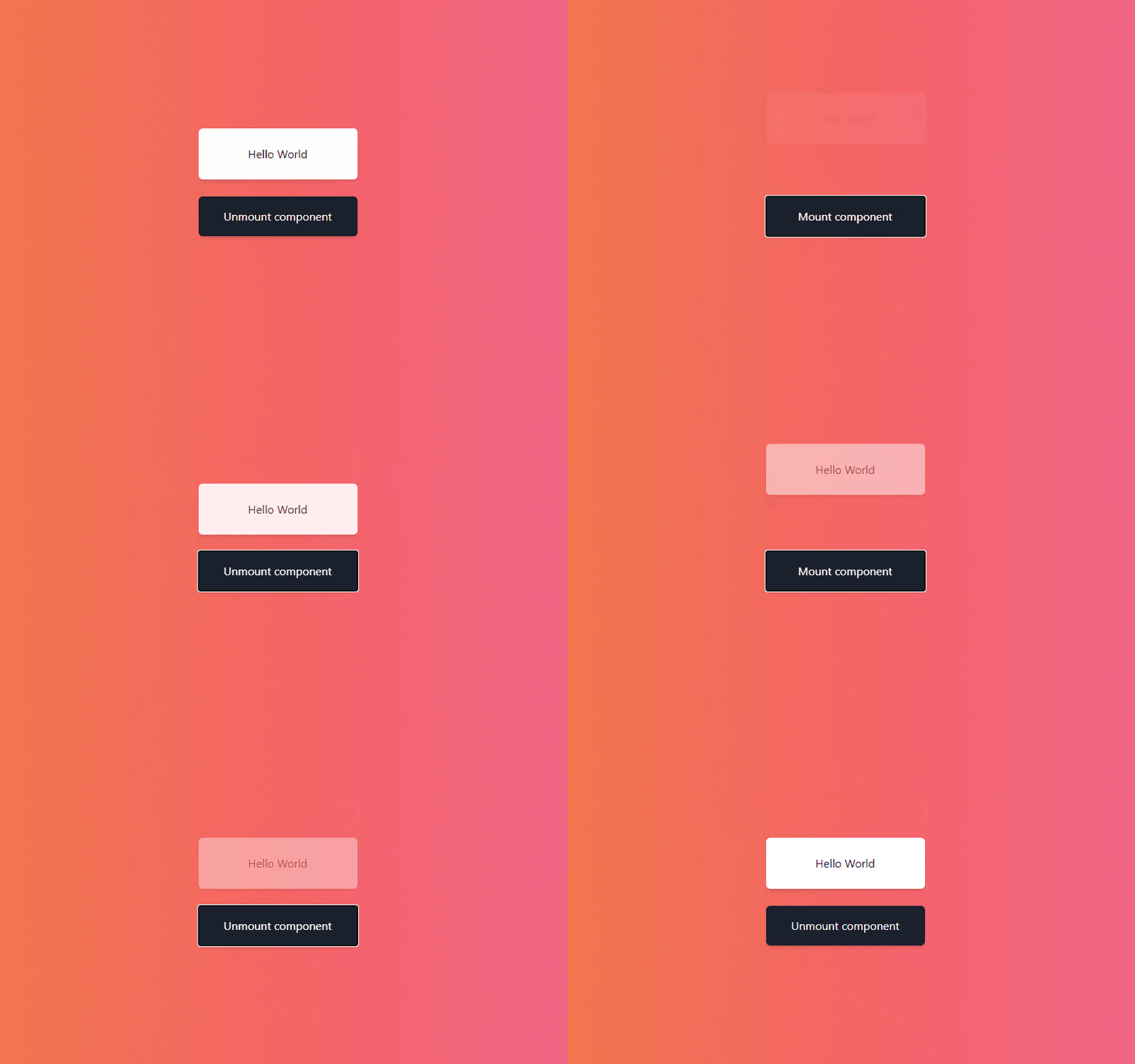
Orchestration
One of Framer Motion's strong suits is its ability to orchestrate different elements through variants. Variants are target objects for simple, single-component animations. These can propagate animations through the DOM, and through this allow orchestration of elements.
Variants are passed into motion components through the variants prop. They normally will look like this:
const variants = {
  visible: { opacity: 0, y: -50 },
  hidden: { opacity: 1, y: 0 },
}

<motion.div initial="hidden" animate="visible" variants={variants} />
These will create the same animation as we did above. You may notice we passed to initial and animate a string. This is strictly used for variants. It tells what keys Framer Motion should look for inside the variants object. For the initial, it will look for 'hidden' and for animate 'visible'.
The benefit of using this syntax is that when the motion component has children, changes in the variant will flow down through the component hierarchy. It will continue to flow down until a child component has its own animate property.
Let's put this into practice! This time we will create a staggering list. Like this:
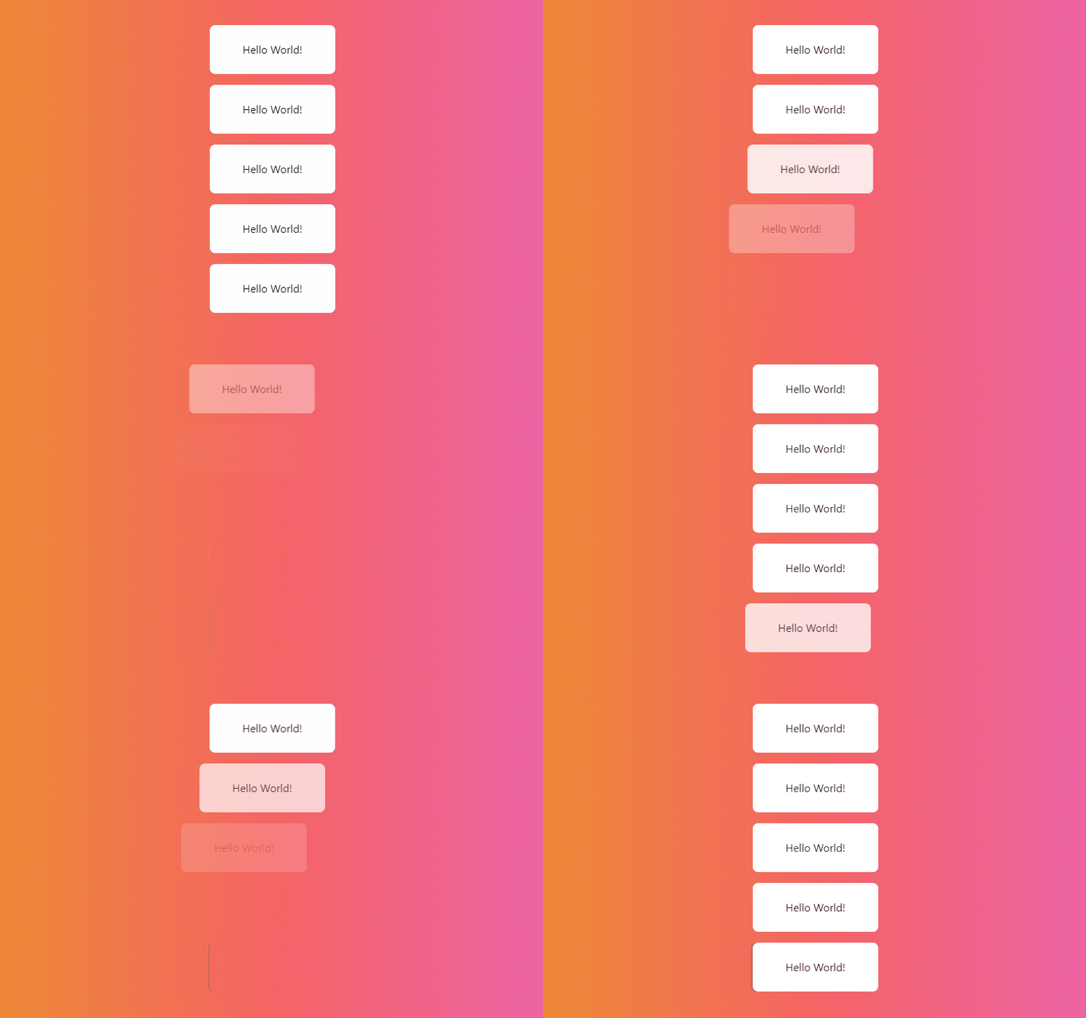
In the image, each item has an increasing delay between each entrance. The first one will enter in 0 seconds, the second in 0.1 seconds, the third in 0.2, and it will keep increasing by 0.1.
To achieve this through variants, first, let's create a variants object where we'll store all possible states and transition options:
const variants = {
  container: {},
  card: {},
};
variants.container and variants.card represent each motion component we'll have.
Let's create the animations for the cards. We see that the cards go from left to right while fading in. This means we have to update its x position and opacity.
As aforementioned, variants can have different keys for their animation states, however, we will leave it as initial and animate to indicate before mount and after mount, respectively.
On initial, our component will be 50 pixels to the left and its opacity will be 0.
On animate, our component will be 0 pixels to the left and its opacity will be 1.
Like this:
const variants = {
  container: {},
  card: {
    initial: {
      opacity: 0,
      x: -50,
    },

    animate: {
      opacity: 1,
      x: 0,
    },
  },
};
Next, we have to add the stagger effect to each of these cards. To achieve this we have to add the container.transition property which allows us to update the behavior of our animation. Inside the property, we'll add a staggerChildren property that defines an incremental delay between the animation of the children.
const variants = {
  container: {
    animate: {
      transition: {
        staggerChildren: 0.1,
      },
    },
  },
  card: {
    initial: {
      opacity: 0,
      x: -50,
    },

    animate: {
      opacity: 1,
      x: 0,
    },
  },
};
Now, if we hook this variant to the motion components:
import { motion } from "framer-motion";

const variants = {
  container: {
    animate: {
      transition: {
        staggerChildren: 0.1,
      },
    },
  },
  card: {
    initial: {
      opacity: 0,
      x: -50,
    },

    animate: {
      opacity: 1,
      x: 0,
    },
  },
};

const StaggeredList = () => {
  return (
    <motion.div
      initial="initial"
      animate="animate"
      variants={variants.container}
    >
      {new Array(5).fill("").map(() => {
        return <Card />;
      })}
    </motion.div>
  );
};

const Card = () => (
  <motion.div variants={variants.card}>Hello World!</motion.div>
);
With this, our animation is complete, and we have a sleek staggered list ready!

Dragging
Dragging is a feature that can be daunting to implement in an app. Thankfully, Framer Motion makes it a lot easier to implement its logic because of its declarative nature. In this post, I will give a simple, general introduction to it. However, in a future tutorial, I may explain in more detail how to create something more complex like a slide to delete.
Making an element draggable is extremely simple: add a drag prop to a motion component. Take for example the following:
import { motion } from "framer-motion";

<motion.div drag>Hello World!</motion.div>;
Adding the drag prop will make it draggable in the x-axis and y-axis. It should be noted that you can restrict the movement to a single axis by providing the desired axis to drag.
There is a problem with just setting the drag property. It is not bound to any area or container so it can move outside the screen like this:
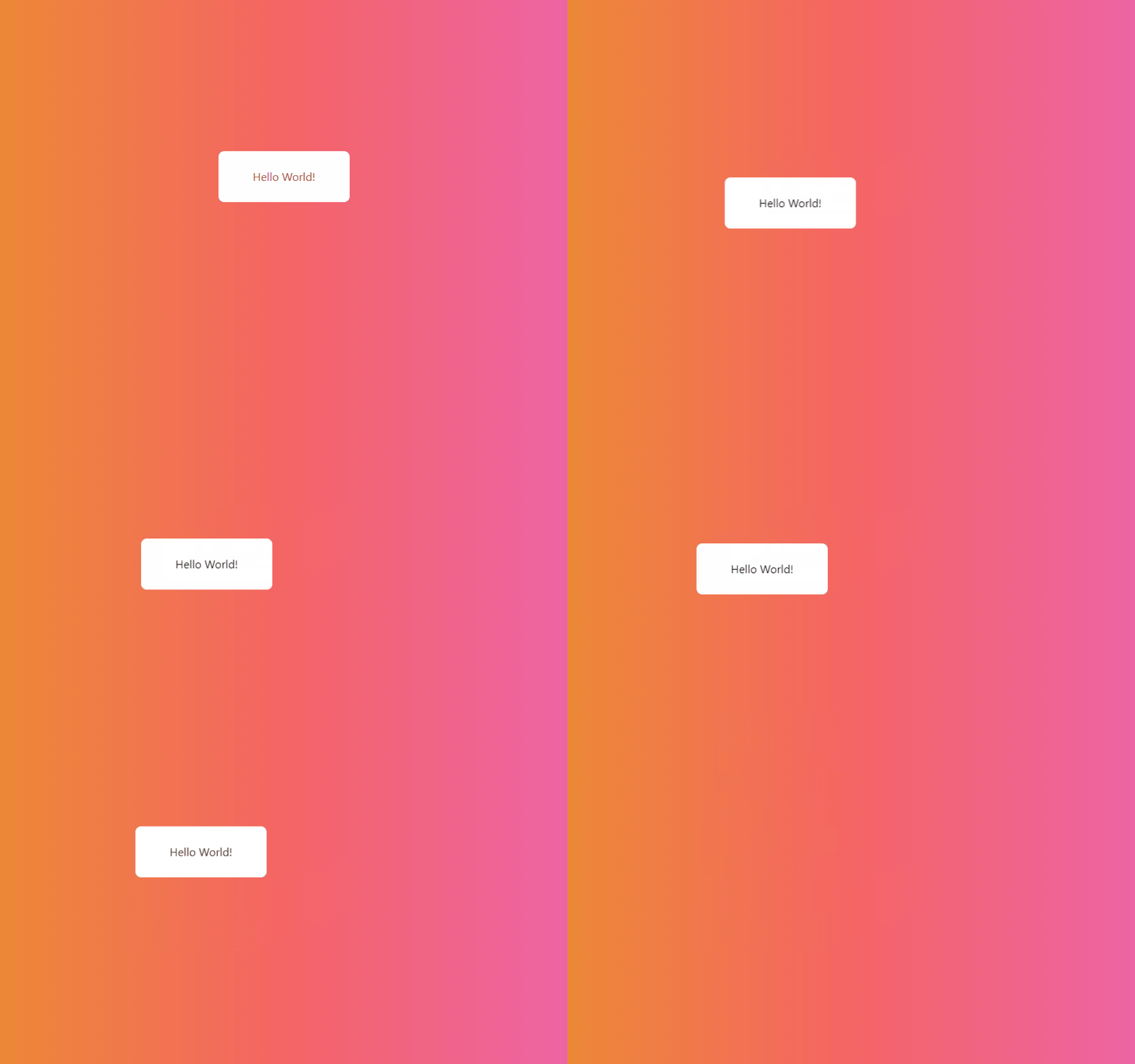
To set constraints we give the dragContraints an object with our desired constraints for every direction: top, left, right, and bottom. Take for example:
import { motion } from "framer-motion";

<motion.div
  drag
  dragConstraints={{
    top: -50,
    left: -50,
    right: 50,
    bottom: 50,
  }}
>
  Hello World!
</motion.div>;
These constraints allow the element to move 50 pixels maximum in any direction. If we try to drag it, for example, 51 pixels to the top, it will be stopped and bounced. Like this:
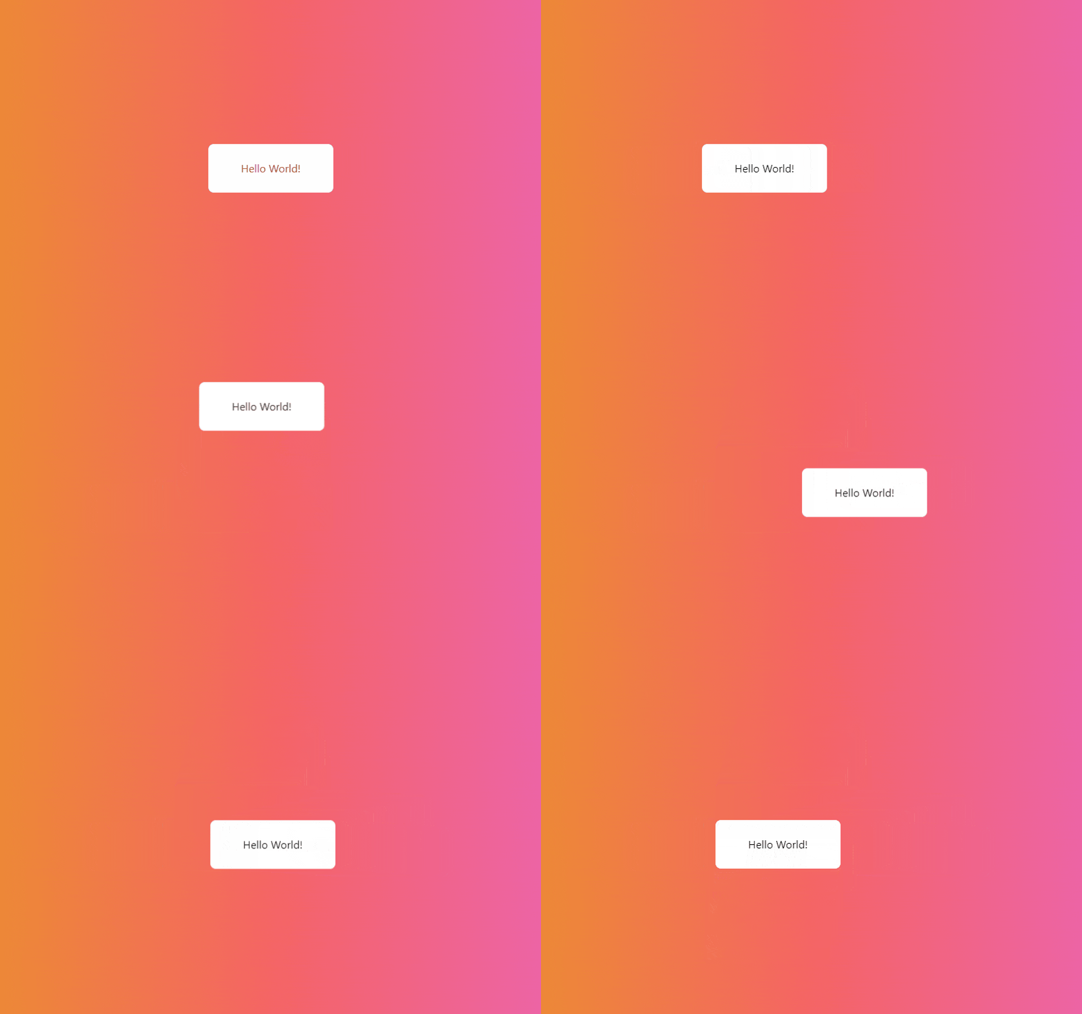
It is as if there is an invisible wall in the form of a square that won't allow the component to move further.
Layout Property
The layout prop is a powerful feature in Framer Motion. It allows for components to animate automatically between layouts. It will detect changes to the style of an element and animate it. This has a myriad of use cases: reordering of lists, creating switches, and many more.
Let's use this immediately! We'll build a switch. First, let's create our initial markup
import { motion } from "framer-motion";

const Switch = () => {
  return (
    <div
      className={`flex w-24 p-1 bg-gray-400 bg-opacity-50 rounded-full cursor-pointer`}
      onClick={toggleSwitch}
    >
      {/* Switch knob */}
      <motion.div
        className="w-6 h-6 p-6 bg-white rounded-full shadow-md"
        layout
      ></motion.div>
    </div>
  );
};
Now, let's add our logic:
import { motion } from "framer-motion";

const Switch = () => {
  const [isOn, setIsOn] = React.useState(false);

  const toggleSwitch = () => setIsOn(!isOn);

  return (
    <div onClick={toggleSwitch}>
      {/* Switch knob */}
      <motion.div layout></motion.div>
    </div>
  );
};
You may have noticed that only our knob has the layout prop. This prop is required on only the elements that we wish to be animated.
We want the knob to move from one side to the other. We could achieve this by changing the container flex justification. When the switch is on, the layout will have justify-content: flex-end. Framer Motion will notice the knob's change of position and will animate its position accordingly.
Let's add this to our code:
import { motion } from "framer-motion";

const Switch = () => {
  const [isOn, setIsOn] = React.useState(false);

  const toggleSwitch = () => setIsOn(!isOn);

  return (
    <div
      style={{
        background: isOn ? "#48bb78" : "rgba(203, 213, 224, 0.5)",
        justifyContent: isOn && "flex-end",
        width: "6rem",
        padding: "0.25rem",
        display: "flex",
        borderRadius: 9999,
        cursor: "pointer",
      }}
      onClick={toggleSwitch}
    >
      {/* Switch knob */}
      <motion.div
        style={{
          width: "3rem",
          height: "3rem",
          background: "white",
          borderRadius: "100%",
          boxShadow:
            "0 4px 6px -1px rgba(0, 0, 0, 0.1), 0 2px 4px -1px rgba(0, 0, 0, 0.06)",
        }}
        layout
      ></motion.div>
    </div>
  );
};
I added some other styles so it can resemble the look of a switch. Anyway, here is the result:
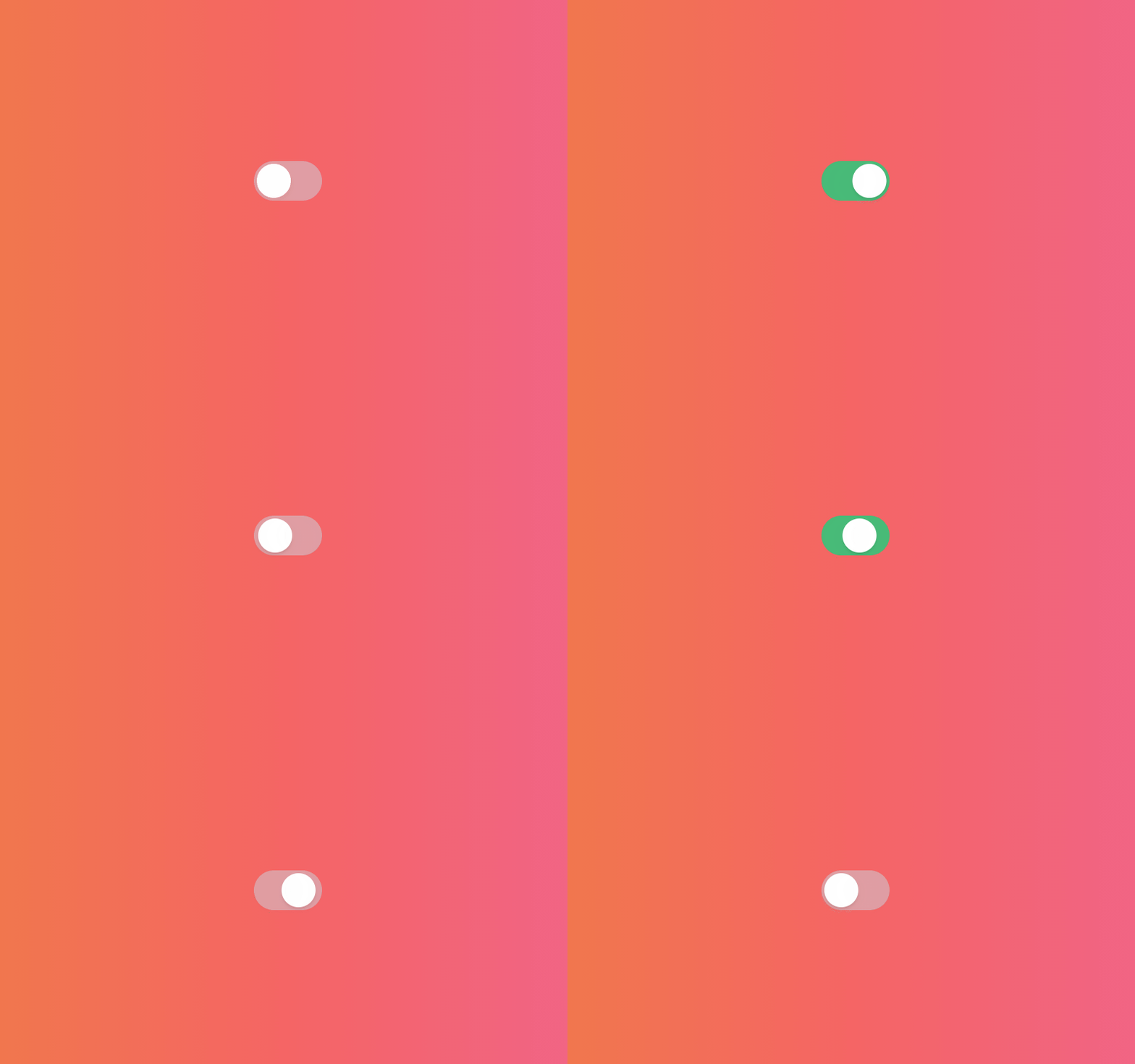
Great! It is amazing how Framer Motion can do this automatically without having to deal with extra controls. Anyhow, it looks a little bland compared to what we are used to seeing on apps like Settings. We can fix this pretty quickly by adding a transition prop.
import { motion } from "framer-motion";

const Switch = () => {
  const [isOn, setIsOn] = React.useState(false);

  const toggleSwitch = () => setIsOn(!isOn);

  return (
    <div
      style={{
        background: isOn ? "#48bb78" : "rgba(203, 213, 224, 0.5)",
        justifyContent: isOn && "flex-end",
        width: "6rem",
        padding: "0.25rem",
        display: "flex",
        borderRadius: 9999,
        cursor: "pointer",
      }}
      onClick={toggleSwitch}
    >
      {/* Switch knob */}
      <motion.div
        style={{
          width: "3rem",
          height: "3rem",
          background: "white",
          borderRadius: "100%",
          boxShadow:
            "0 4px 6px -1px rgba(0, 0, 0, 0.1), 0 2px 4px -1px rgba(0, 0, 0, 0.06)",
        }}
        layout
        transition={{
          type: "spring",
          stiffness: 500,
          damping: 30,
        }}
      ></motion.div>
    </div>
  );
};
We define a spring-type animation because we want a bouncy feel.
The stiffness defines how sudden the movement of the knob will look.
And, damping defines the strength of the opposing force similar to friction. This means how fast it will stop moving.
These together create the following effect:

Now our switch looks more alive!
Conclusion
Creating animations can be daunting, especially when many libraries have complex jargon. Thankfully, Framer Motion allows developers to create seamless animations with its declarative and intuitive API.
This post was meant as an introduction to the fundamentals of Framer Motion. In future posts, I will create complex animations like swipe to expand and delete, drawers, shared layout, and many more. Please let me know in the comments if you have any suggestions as to what you want to see animated!
For more up-to-date web development content, follow me on Twitter, and Dev.to! Thanks for reading! 😎

