Page Transitions In React
Smooth and cool page transitions are something we all love to see while browsing on Dribbble. I have always been fascinated and asked myself how I could do it for my sites.
Once, I was able to achieve it in a site built with Next.js by using a library called next-page-transitions. It allowed me to create the transitions I wanted with CSS. However, I hit a problem.
It was very limiting and inflexible since it was made through CSS classes. I couldn't create a custom experience on every page without having a lot of classes and having to deal with re-renders. Thankfully, Framer Motion's Animate Presence API makes it possible to create sleek and custom page transitions in any React framework easily without having to worry about these problems.
Animate Presence
In my previous post, I introduced the <AnimatePresence/> component. It triggers the exit prop animations from all its children when they're removed from React's render tree. Basically, it detects when a component unmounts and animates this process.
Recently, Framer Motion introduced a prop called exitBeforeEnter. If it is set to true, it will only render one component at a time. It will wait for the existing component to finish its animation before the new component is rendered. This is perfect for handling page transitions since we can guarantee that only a component or page is rendered at a time.
A Small Example
Let's test what we learned about <AnimatePresence/>. First, we'll test it without the exitBeforeEnter prop by doing a simple transition to see how it behaves.
This website will be a mimic of an E-commerce. It will have two pages: Store and Contact Us. They will have a very simple layout. Like this:


Our first step is to wrap our pages inside a <AnimatePresence/>. Where we wrap it will depend on where our router is rendering the pages. Keep in mind that each of the children needs to have a unique key prop so it can track their presence in the tree.
In Next.js we would head to the _app.js file, and wrap the <Component> with <AnimatePresence/>.
// pages/_app.js

import { AnimatePresence } from "framer-motion";
import "../styles/index.css";

function MyApp({ Component, pageProps, router }) {
  return (
    <AnimatePresence>
      <Component key={router.route} {...pageProps} />
    </AnimatePresence>
  );
}

export default MyApp;
For Create React App, we would use it wherever our router is rendering the pages.
import React from "react";
import { Switch, Route, useLocation, useHistory } from "react-router-dom";
import { AnimatePresence } from "framer-motion";

const App = () => {
  const location = useLocation();

  return (
    <AnimatePresence>
      <Switch location={location} key={location.pathname}>
        <Route path="/contact" component={IndexPage} />
        <Route path="/contact" component={ContactPage} />
      </Switch>
    </AnimatePresence>
  );
};
💡 Check out the website's code for each framework in this GitHub repository.
Now that we have all our pages wrapped in an <AnimatePresence>, if we try to change routes, you'll notice that the current component never unmounts.
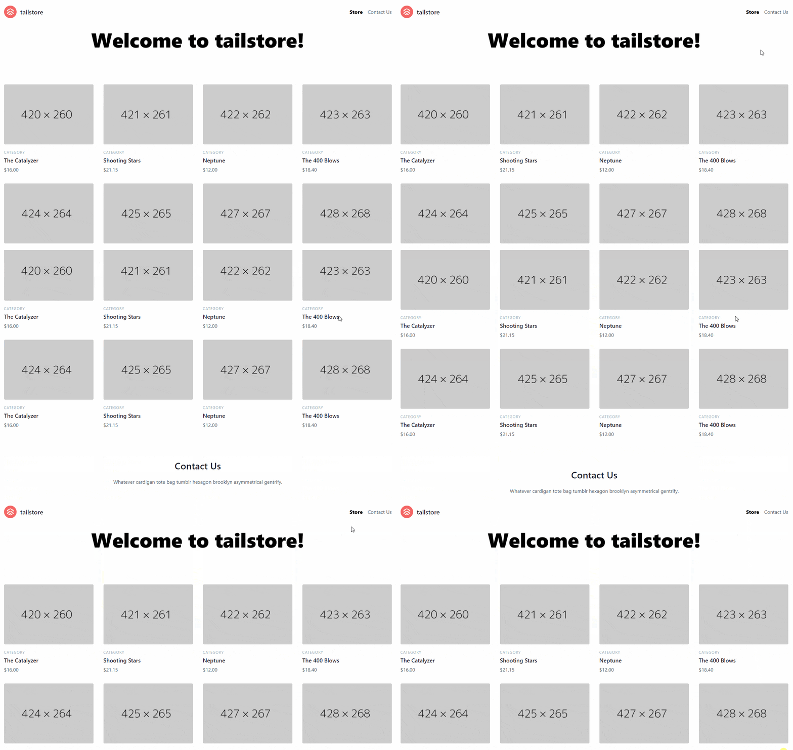
This happens because Framer Motion is looking for an exit animation for each page, and it is not found because we haven't defined any motion component yet.
Let's add a simple fade-out animation to each page. Like this:
import { motion } from "framer-motion"

<motion.div exit={{ opacity: 0 }}>
	... content
</motion.div>
And now the components can unmount!
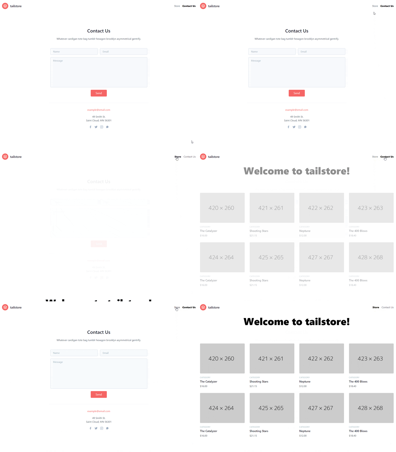
If you pay close attention, before our contact form disappears, the index page appears at the bottom, creating a distraction and ruining the fluidity of our animation. This would be really bad if we were to have a mount animation on the Index page.
This is where the exitBeforeEnter prop comes in handy. It guarantees that our component will have unmounted before allowing the new component to load in. If we add the prop to the <AnimatePresence/>, you will notice it is no longer a problem, and our transition is smooth and working as desired.
<AnimatePresence exitBeforeEnter/>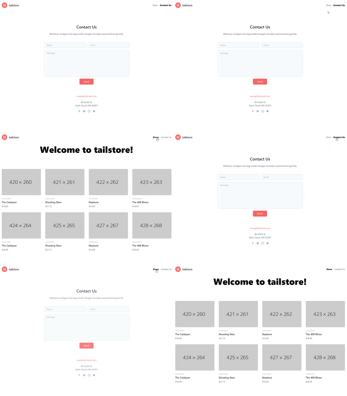
This is all that is needed to create transitions with Framer Motion. The sky is the limit when it comes to what we can do now!
A Beautiful Transition From Dribbble
Have you ever wanted to create amazing transitions like those seen in Dribbble? I always have. Thankfully, Framer Motion allows us to re-create these with ease. Take a look at this design by Franchesco Zagami:
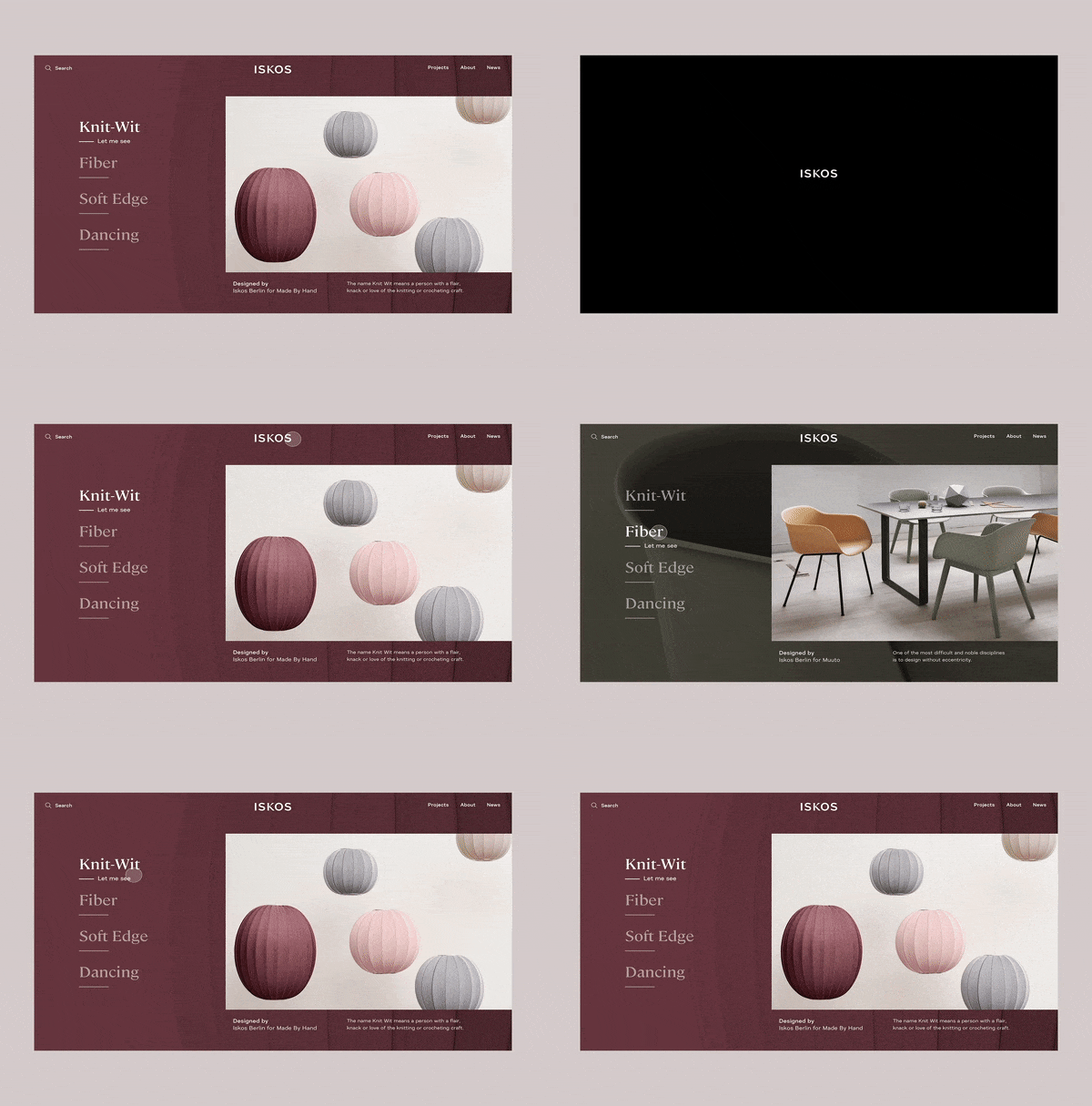
Let's try to re-create this awesome transition.
When translating transition prototypes, it would be best to have the original file so the easings and details of the animation can be known. However, since we are taking a Dribbble design, we'll re-create it by estimating its values.
Initial Transition
One of the elements that we first see is a black background that moves toward the end of the screen. This is really easy to re-create because of Framer's abstractions.
First, we'll create a component that will house all our initial transition logic so it can be easier to maintain and develop.
const InitialTransition = () => {};Second, add the black square which will have the size of the screen.
const blackBox = {
  initial: {
    height: "100vh",
  },
};

const InitialTransition = () => {
  return (
    <div className="absolute inset-0 flex items-center justify-center">
      <motion.div
        className="relative z-50 w-full bg-black"
        initial="initial"
        animate="animate"
	      variants={blackBox}
      />
    </div>
  );
};
Instead of using motion props, we'll use variants since further down we'll have to handle more elements.
💡 If you want to learn how to use Framer Motion variants, you can check out my beginner's tutorial!
So far, we will have a black square in the middle of our screen. We'll use the bottom and height properties to create a downward movement. The bottom property will make it collapse towards the bottom.
const blackBox = {
  initial: {
    height: "100vh",
    bottom: 0,
  },
  animate: {
    height: 0,
  },
};

const InitialTransition = () => {
  return (
    <div className="absolute inset-0 flex items-center justify-center">
      <motion.div
        className="relative z-50 w-full bg-black"
        initial="initial"
        animate="animate"
	      variants={blackBox}
      />
    </div>
  );
};
This is what we have now:
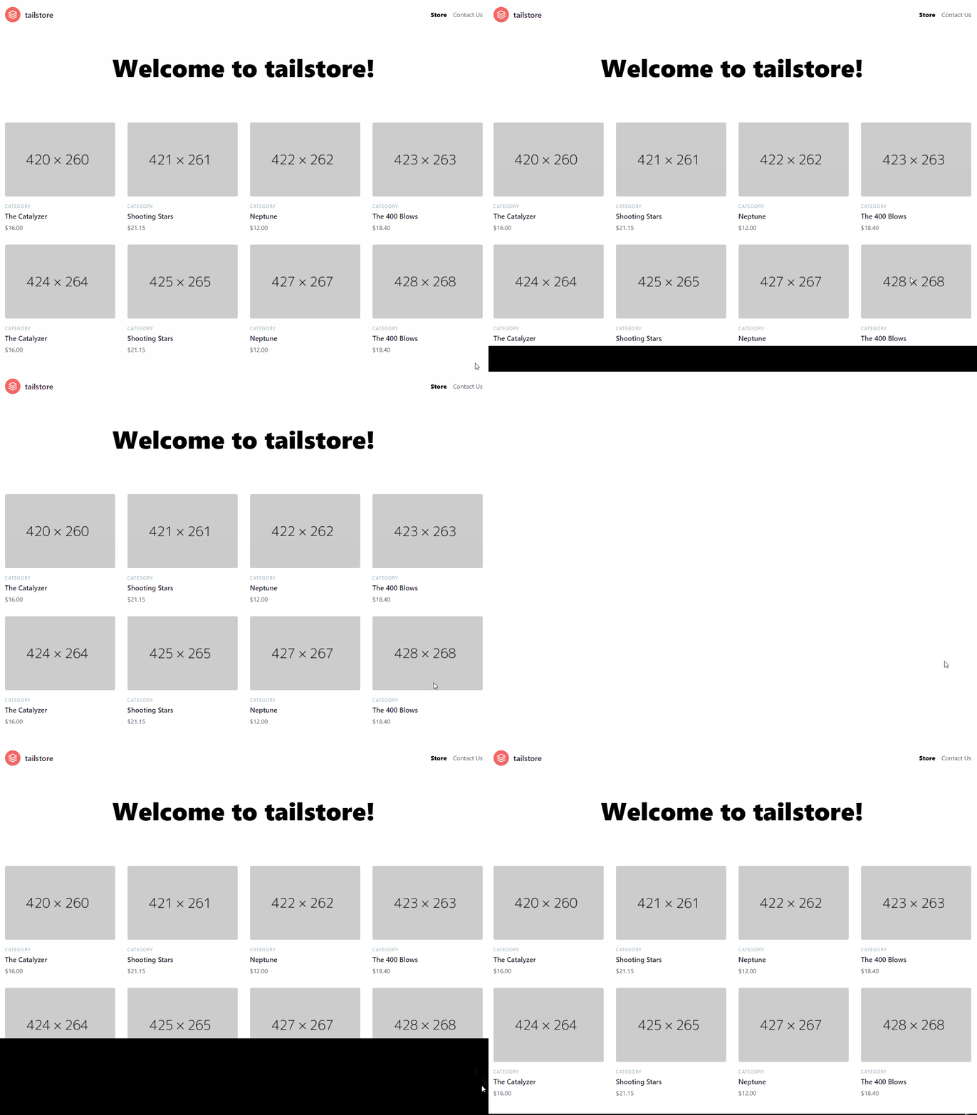
If you compare this to our reference, you'll notice the animation happens very quickly and not fluid enough. We can fix this with the transition property. We'll modify the duration to make our animation slower and ease to make it smoother.
const blackBox = {
  initial: {
    height: "100vh",
    bottom: 0,
  },
  animate: {
    height: 0,
    transition: {
      duration: 1.5,
      ease: [0.87, 0, 0.13, 1],
    },
  },
};
It will look much more similar:

Now, we have to re-create the text. Albeit, we'll do something different. Since our text is not located in the middle of our navbar, we'll just fade it out.
The text is a little harder than the black square because if we take a close look it has an animated layer similar to a mask. A way we could achieve this effect is through SVG elements, specifically the <text/> and <pattern/>. It will look like this:
<motion.div
  className="absolute z-50 flex items-center justify-center w-full bg-black"
  initial="initial"
  animate="animate"
  variants={blackBox}
>
	<motion.svg className="absolute z-50 flex">
	  <pattern
	    id="pattern"
	    patternUnits="userSpaceOnUse"
	    width={750}
	    height={800}
	    className="text-white"
	  >
	    <rect className="w-full h-full fill-current" />
	    <motion.rect className="w-full h-full text-gray-600 fill-current" />
	  </pattern>
	  <text
	    className="text-4xl font-bold"
	    text-anchor="middle"
	    x="50%"
	    y="50%"
	    style={{ fill: "url(#pattern)" }}
	  >
	    tailstore
	  </text>
	</svg>
</motion.svg>
This works by setting a custom text fill with <pattern/>. It will have two <rect/>. One for the color of the text and the other for the animation which will be a motion element. Basically, the latter will hide and will leave a white color.
Let's proceed to animate this.
First, let's introduce a new transition property called when. It defines when an element should carry out its animation. We want our black box to disappear when all children are done rendering hence afterChildren:
const blackBox = {
  initial: {
    height: "100vh",
    bottom: 0,
  },
  animate: {
    height: 0,
    transition: {
      when: "afterChildren",
      duration: 1.5,
      ease: [0.87, 0, 0.13, 1],
    },
  },
};
Now, when our text finishes rendering, our black box will do its animation.
Second, we'll animate the <svg/> . Here is its variant:
const textContainer = {
  initial: {
    opacity: 1,
  },
  animate: {
    opacity: 0,
    transition: {
      duration: 0.25,
      when: "afterChildren",
    },
  },
};

<motion.svg variants={textContainer} className="absolute z-50 flex"></motion.svg>
Finally, the <rect/>:
const text = {
  initial: {
    y: 40,
  },
  animate: {
    y: 80,
    transition: {
      duration: 1.5,
      ease: [0.87, 0, 0.13, 1],
    },
  },
};

<motion.rect
  variants={text}
  className="w-full h-full text-gray-600 fill-current"
/>
💡 You may be asking yourself where do I get most of these animation values. All of them except the
easewere fine tweaked through estimation. For easing, I used this cheat sheet, specifically theeaseInOutExpovalues.
With all these hooked up, you should see this:
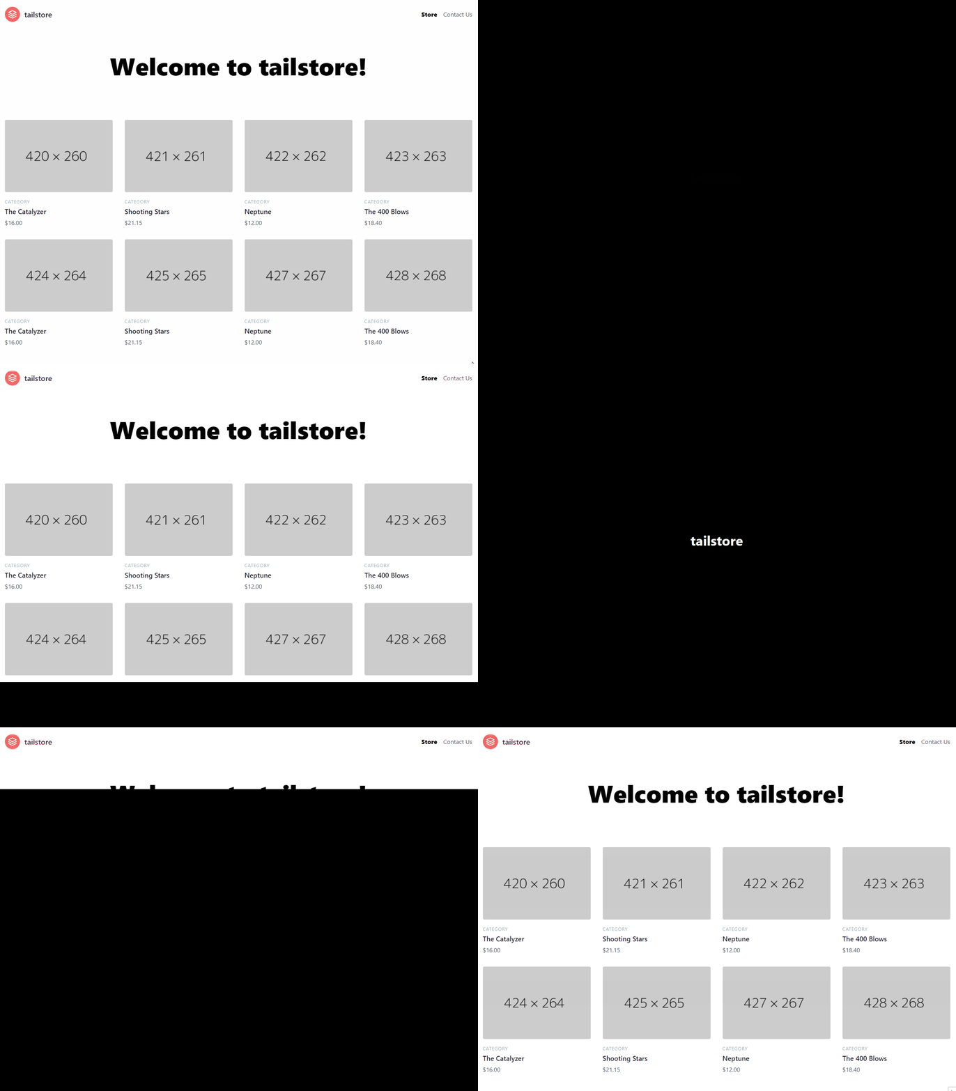
Awesome! It's looking very close to our design.
You may have noticed that we can still scroll even though our screen is supposed to be busy showing our transition. Luckily this is really easy to fix. We just need to apply overflow: hidden to our body when it is animating and remove it when it's done.
Thankfully, motion components have event listeners for this exact situation: onAnimationStart, and onAnimationComplete. The former is triggered when the animation defined in animate starts and the latter when it ends.
On our InitialTransition add the following:
<motion.div
  className="absolute z-50 flex items-center justify-center w-full bg-black"
  initial="initial"
  animate="animate"
  variants={blackBox}
  onAnimationStart={() => document.body.classList.add("overflow-hidden")}
  onAnimationComplete={() =>
    document.body.classList.remove("overflow-hidden")
  }
>
</motion.div>
Animating the Content
All that is left is to create sleek animation for our content. We won't copy the same animation as the design since it wouldn't match our site very well. What we'll do is a staggering fade in down effect on the children. Let's create our variants:
const content = {
  animate: {
    transition: { staggerChildren: 0.1, delayChildren: 2.8 },
  },
};

const title = {
  initial: { y: -20, opacity: 0 },
  animate: {
    y: 0,
    opacity: 1,
    transition: {
      duration: 0.7,
      ease: [0.6, -0.05, 0.01, 0.99],
    },
  },
};

const products = {
  initial: { y: -20, opacity: 0 },
  animate: {
    y: 0,
    opacity: 1,
    transition: {
      duration: 0.7,
      ease: [0.6, -0.05, 0.01, 0.99],
    },
  },
};

export default function IndexPage() {
  return (
    <motion.section exit={{ opacity: 0 }}>
      <InitialTransition />

      <motion.div
        initial="initial"
        animate="animate"
        variants={content}
        className="space-y-12"
      >
        <motion.h1 variants={title} className="text-6xl font-black text-center">
          Welcome to tailstore!
        </motion.h1>

        <motion.section variants={products} className="text-gray-700 body-font">
        </motion.section>
      </motion.div>
    </motion.section>
  );
}
You'll be familiar with most of the properties except delayChildren. It applies a delay to all the children of a propagated animation. In other words, it will display the children after a certain amount of time.
Aside from this, we are just making the element fade down, add a duration of 0.7 seconds, and smooth it with an easing. Here is the result:
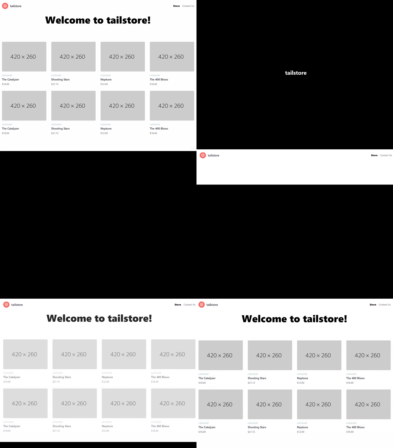
Let's do the same for our contact page:
const content = {
  animate: {
    transition: { staggerChildren: 0.1 },
  },
};

const title = {
  initial: { y: -20, opacity: 0 },
  animate: {
    y: 0,
    opacity: 1,
    transition: {
      duration: 0.7,
      ease: [0.6, -0.05, 0.01, 0.99],
    },
  },
};

const inputs = {
  initial: { y: -20, opacity: 0 },
  animate: {
    y: 0,
    opacity: 1,
    transition: {
      duration: 0.7,
      ease: [0.6, -0.05, 0.01, 0.99],
    },
  },
};

<motion.section
  exit={{ opacity: 0 }}
  class="text-gray-700 body-font relative"
>
  <motion.div variants={content} animate="animate" initial="initial" class="container px-5 py-24 mx-auto">
    <motion.div variants={title} class="flex flex-col text-center w-full mb-12">
    </motion.div>
    <motion.div variants={inputs} class="lg:w-1/2 md:w-2/3 mx-auto">
    </motion.div>
  </motion.div>
</motion.section>
UX Improvements
Transitioning between Contact and Store will take a long while since it will play the initial transition again. Doing this every time will annoy the user.
We can fix this problem by only playing the animation if it is the first page the user loads. To achieve this, we'll listen for a route change globally, and determine if it is the first render. If it is, we'll show the initial transition; otherwise, skip it and remove the delay on the children.
In Next.js we would detect a route change through the routeChangeStart event on _app.js.
💡 Solutions will vary between frameworks. For the sake of keeping this blog post as simple as possible, I will elaborate on Next.js implementation. However, the repository will have solutions in their respective frameworks.
On _app.js:
function MyApp({ Component, pageProps, router }) {
  const [isFirstMount, setIsFirstMount] = React.useState(true);

  React.useEffect(() => {
    const handleRouteChange = () => {
      isFirstMount && setIsFirstMount(false);
    };

    router.events.on("routeChangeStart", handleRouteChange);

    // If the component is unmounted, unsubscribe
    // from the event with the `off` method:
    return () => {
      router.events.off("routeChangeStart", handleRouteChange);
    };
  }, []);

  return (
    <Layout>
      <AnimatePresence exitBeforeEnter>
        <Component
          isFirstMount={isFirstMount}
          key={router.route}
          {...pageProps}
        />
      </AnimatePresence>
    </Layout>
  );
}
We are keeping the state on the first mount which is updated only when a user does the first route change. And, we pass this variable as a prop to the currently rendered page.
On our index.js :
const content = (isFirstMount) => ({
  animate: {
    transition: { staggerChildren: 0.1, delayChildren: isFirstMount ? 2.8 : 0 },
  },
});

// ...

export default function IndexPage({ isFirstMount }) {
  return (
    <motion.section exit={{ opacity: 0 }}>
      {isFirstMount && <InitialTransition />}

      <motion.div
        initial="initial"
        animate="animate"
        variants={content(isFirstMount)}
        className="space-y-12"
      >
        <motion.h1 variants={title} className="text-6xl font-black text-center">
        </motion.h1>

        <motion.section variants={products} className="text-gray-700 body-font">
        </motion.section>
      </motion.div>
    </motion.section>
  );
}
That's it! Our page has amazing transitions and the user will not feel annoyed by replaying the same animation over and over.
Conclusion
Sleek page transitions are very important to achieve awesome web experiences. Using CSS can be hard to maintain since one will deal with many classes and lack of independence. Thankfully, Framer Motion solves this problem with Animate Presence. Coupled with exitBeforeEnter, it allows developers to create amazing page transitions. It is so flexible and powerful that through a few lines of code, we could mimic a complex animation found on Dribbble.
I hope this post inspires you to create awesome page transitions so you can impress your future employer or clients.
For more up-to-date web development content, follow me on Twitter, and Dev.to! Thanks for reading! 😎


