Logo

Using React Spring to Animate SVG Icons: Dark Mode Toggle

cover image

Don't want to code along? See this button as a package on Github.

Creating amazing user experiences for users on a website is the main objective of a web developer. Sometimes we see amazing animations that bring the website to life. In this instance, I want to focus on dark and light mode toggle, specifically sun and moon transition. Here are some examples of what we will be inspired by:

Sun and moon animated icon transition

Sun and moon animated icon transition

We will be building this with SVGs and React Spring. In short, what makes this method possible is the use of an SVG mask. It allows us to do hide two icons in one, and change their properties with animation using React Springs. This will guarantee a fluid spring-physics transition and be able to use Javascript to display whichever icon we need.

I assume you have created a React project. If not, please do so with something like Create React App.
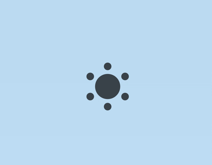
Getting the Icons

We'll use the following sun and moon icons from Feather Icons:

Sun and moon icons from Feather Icons

These icons are licensed under the open-source MIT License.

Here are the SVG codes for only the sun since we will be creating the moon icon through a mask!

<svg
  xmlns="http://www.w3.org/2000/svg"
  width="24"
  height="24"
  viewBox="0 0 24 24"
  fill="none"
  stroke="currentColor"
  stroke-width="2"
  stroke-linecap="round"
  stroke-linejoin="round"
>
  <circle cx="12" cy="12" r="5" />
  <line x1="12" y1="1" x2="12" y2="3" />
  <line x1="12" y1="21" x2="12" y2="23" />
  <line x1="4.22" y1="4.22" x2="5.64" y2="5.64" />
  <line x1="18.36" y1="18.36" x2="19.78" y2="19.78" />
  <line x1="1" y1="12" x2="3" y2="12" />
  <line x1="21" y1="12" x2="23" y2="12" />
  <line x1="4.22" y1="19.78" x2="5.64" y2="18.36" />
  <line x1="18.36" y1="5.64" x2="19.78" y2="4.22" />
</svg>

Meshing Both Icons Into One

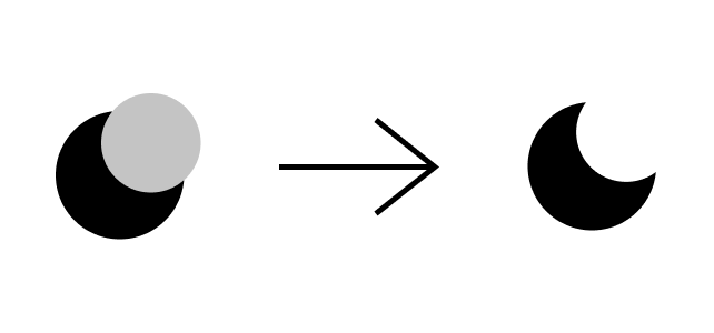
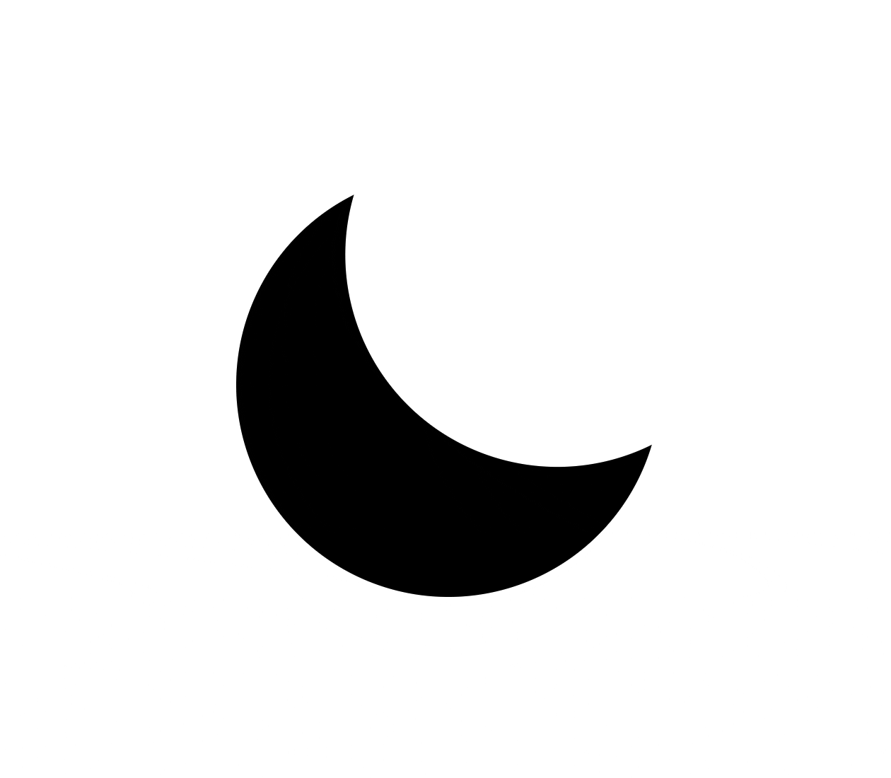
In order to create the moon, we have to understand what is an SVG mask. It is an element that defines an alpha mask for compositing the current object into the background. In other words, SVG masks allow us to define areas in the background that are transparent or not using SVG elements. In CSS we determine the opacity of the mask (how much of the element is shown) by using colors. The closer the color is to black the less opacity it will have and the closer to white the more opacity.

We will be using a circle shape inside the mask to hide a portion of the sun's circle so it will create the curve of the moon.

Something like this:

Circle masked with another circle to create moon icon.

First, we will fill the circle since it will make it easier to create our mask:

<svg
  xmlns="http://www.w3.org/2000/svg"
  width="24"
  height="24"
  viewBox="0 0 24 24"
  fill="none"
  stroke="currentColor"
  stroke-width="2"
  stroke-linecap="round"
  stroke-linejoin="round"
>
  <circle fill="black" cx="12" cy="12" r="5" />
  <line x1="12" y1="1" x2="12" y2="3" />
  <line x1="12" y1="21" x2="12" y2="23" />
  <line x1="4.22" y1="4.22" x2="5.64" y2="5.64" />
  <line x1="18.36" y1="18.36" x2="19.78" y2="19.78" />
  <line x1="1" y1="12" x2="3" y2="12" />
  <line x1="21" y1="12" x2="23" y2="12" />
  <line x1="4.22" y1="19.78" x2="5.64" y2="18.36" />
  <line x1="18.36" y1="5.64" x2="19.78" y2="4.22" />
</svg>;

Then, wrap our lines in a <g/> which is basically the div for SVG elements:

<svg
  xmlns="http://www.w3.org/2000/svg"
  width="24"
  height="24"
  viewBox="0 0 24 24"
  fill="none"
  stroke="currentColor"
  stroke-width="2"
  stroke-linecap="round"
  stroke-linejoin="round"
>
  <circle fill="black" cx="12" cy="12" r="5" />
	<g stroke="currentColor">
      <line x1="12" y1="1" x2="12" y2="3" />
      <line x1="12" y1="21" x2="12" y2="23" />
      <line x1="4.22" y1="4.22" x2="5.64" y2="5.64" />
      <line x1="18.36" y1="18.36" x2="19.78" y2="19.78" />
      <line x1="1" y1="12" x2="3" y2="12" />
      <line x1="21" y1="12" x2="23" y2="12" />
      <line x1="4.22" y1="19.78" x2="5.64" y2="18.36" />
      <line x1="18.36" y1="5.64" x2="19.78" y2="4.22" />
   </g>
</svg>

We will have something like this:

Sun icon

Now, we will create our mask. To declare a mask in SVG, we create a <mask/>, give it an id, and reference it in the element to be masked, in this case, the <circle/>.

<svg
  xmlns="http://www.w3.org/2000/svg"
  width="24"
  height="24"
  viewBox="0 0 24 24"
  fill="none"
  stroke="currentColor"
  stroke-width="2"
  stroke-linecap="round"
  stroke-linejoin="round"
>
	<mask id="mask">       
  </mask>
  <circle fill="black" cx="12" cy="12" r="5" mask="url(#mask)"/>
	<g stroke="currentColor">
      <line x1="12" y1="1" x2="12" y2="3" />
      <line x1="12" y1="21" x2="12" y2="23" />
      <line x1="4.22" y1="4.22" x2="5.64" y2="5.64" />
      <line x1="18.36" y1="18.36" x2="19.78" y2="19.78" />
      <line x1="1" y1="12" x2="3" y2="12" />
      <line x1="21" y1="12" x2="23" y2="12" />
      <line x1="4.22" y1="19.78" x2="5.64" y2="18.36" />
      <line x1="18.36" y1="5.64" x2="19.78" y2="4.22" />
   </g>
</svg>

With this change, we won't be able to see our icon temporarily because the mask is assuming everything must be transparent. Therefore, let's start by creating a pseudo-canvas that will show the whole icon. To achieve this, inside the mask we will create a <rect/> (rectangle) that will have the same height and width of the SVG, and filled with white that will show everything (remember anything closer to white has higher opacity and vice versa).

<svg
  xmlns="http://www.w3.org/2000/svg"
  width="24"
  height="24"
  viewBox="0 0 24 24"
  fill="none"
  stroke="currentColor"
  stroke-width="2"
  stroke-linecap="round"
  stroke-linejoin="round"
>
	<mask id="mask">
     <rect x="0" y="0" width="100%" height="100%" fill="white" />     
  </mask>
  <circle fill="black" cx="12" cy="12" r="5" mask="url(#mask)"/>
	<g stroke="currentColor">
      <line x1="12" y1="1" x2="12" y2="3" />
      <line x1="12" y1="21" x2="12" y2="23" />
      <line x1="4.22" y1="4.22" x2="5.64" y2="5.64" />
      <line x1="18.36" y1="18.36" x2="19.78" y2="19.78" />
      <line x1="1" y1="12" x2="3" y2="12" />
      <line x1="21" y1="12" x2="23" y2="12" />
      <line x1="4.22" y1="19.78" x2="5.64" y2="18.36" />
      <line x1="18.36" y1="5.64" x2="19.78" y2="4.22" />
   </g>
</svg>

Now that we are showing our icon through our mask, we have to draw a circle with a black fill which will hide the portion of our circle and display the moon. Before doing this, we will do two things: increase the radius of the circle since the sun has a lower radius than the moon, and hide rays temporarily

<svg
  xmlns="http://www.w3.org/2000/svg"
  width="24"
  height="24"
  viewBox="0 0 24 24"
  fill="none"
  stroke="currentColor"
  stroke-width="2"
  stroke-linecap="round"
  stroke-linejoin="round"
>
	<mask id="mask">
     <rect x="0" y="0" width="100%" height="100%" fill="white" />     
  </mask>
  <circle fill="black" cx="12" cy="12" r="9" mask="url(#mask)"/>	
	{/* <g stroke="currentColor">
        <line x1="12" y1="1" x2="12" y2="3" />
        <line x1="12" y1="21" x2="12" y2="23" />
        <line x1="4.22" y1="4.22" x2="5.64" y2="5.64" />
        <line x1="18.36" y1="18.36" x2="19.78" y2="19.78" />
        <line x1="1" y1="12" x2="3" y2="12" />
        <line x1="21" y1="12" x2="23" y2="12" />
        <line x1="4.22" y1="19.78" x2="5.64" y2="18.36" />
        <line x1="18.36" y1="5.64" x2="19.78" y2="4.22" />
      </g> */}
</svg>

Finally, let's add a circle inside our mask. The circle will be located at the same x of the center but will be at the top to hide only a fraction of our center circle. Also, we will rotate the SVG using a style attribute to show the moon in its right position.

<svg
      xmlns="http://www.w3.org/2000/svg"
      width="24"
      height="24"
      viewBox="0 0 24 24"
      fill="none"
      stroke="currentColor"
      stroke-width="2"
      stroke-linecap="round"
      stroke-linejoin="round"
      style={{ transform: "rotate(40deg)" }}
    >
      <mask id="mask">
        <rect x="0" y="0" width="100%" height="100%" fill="white" /> 
        <circle cx="12" cy="4" r="9" fill="black" />    
      </mask>
      <circle fill="black" cx="12" cy="12" r="9" mask="url(#mask)" />
      {/* <g stroke="currentColor">
        <line x1="12" y1="1" x2="12" y2="3" />
        <line x1="12" y1="21" x2="12" y2="23" />
        <line x1="4.22" y1="4.22" x2="5.64" y2="5.64" />
        <line x1="18.36" y1="18.36" x2="19.78" y2="19.78" />
        <line x1="1" y1="12" x2="3" y2="12" />
        <line x1="21" y1="12" x2="23" y2="12" />
        <line x1="4.22" y1="19.78" x2="5.64" y2="18.36" />
        <line x1="18.36" y1="5.64" x2="19.78" y2="4.22" />
      </g> */}
    </svg>

With this our moon is ready!

Moon icon

Animating the Icons

To change from moon to sun we have to follow the next steps:

  1. Reduce the radius of the center circle.
  2. Hide the mask's circle.
  3. Show the rays.
  4. Rotate the SVG to its original position.

We could achieve this with normal React state or CSS animations, but that will not create smooth spring-base animations that create the feeling we want. Therefore, we will be using React Spring. Let's install it:

yarn add react-spring

Once added, let's proceed to add create an object that will house the two states properties: one for the sun and other for the moon:

const properties = {
  sun: {
    r: 9,
    transform: "rotate(40deg)",
    cx: 12,
    cy: 4,
    opacity: 0
  },
  moon: {
    r: 5,
    transform: "rotate(90deg)",
    cx: 30,
    cy: 0,
    opacity: 1
  }
};

You may have noticed that in the sun we are rotating it to 40° instead of 0°. I did this to make the animation go from bottom to top which looks better in my opinion.

First, let's give the component a state. I will name it isDarkMode since my main purpose is to use these icons for dark mode. Then, create a toggle function to change states and add cursor: "pointer" property in styles.

const AnimatedIcon = () => {
  const [isDarkMode, setDarkMode] = React.useState(false);

  const toggleDarkMode = () => {
    setDarkMode(previous => !previous);
  };

  return (
    <svg
      xmlns="http://www.w3.org/2000/svg"
      width="24"
      height="24"
      viewBox="0 0 24 24"
      fill="none"
      stroke="currentColor"
      stroke-width="2"
      stroke-linecap="round"
      stroke-linejoin="round"
      style={{ transform: "rotate(40deg)", cursor: "pointer" }}
      onClick={toggleDarkMode}
    >
      <mask id="mask">
        <rect x="0" y="0" width="100%" height="100%" fill="white" />
        <circle cx="12" cy="4" r="9" fill="black" />
            
      </mask>
      <circle fill="black" cx="12" cy="12" r="9" mask="url(#mask)" />
      {/* <g stroke="currentColor">
        <line x1="12" y1="1" x2="12" y2="3" />
        <line x1="12" y1="21" x2="12" y2="23" />
        <line x1="4.22" y1="4.22" x2="5.64" y2="5.64" />
        <line x1="18.36" y1="18.36" x2="19.78" y2="19.78" />
        <line x1="1" y1="12" x2="3" y2="12" />
        <line x1="21" y1="12" x2="23" y2="12" />
        <line x1="4.22" y1="19.78" x2="5.64" y2="18.36" />
        <line x1="18.36" y1="5.64" x2="19.78" y2="4.22" />
      </g> */}
    </svg>
  );
};

Second, let's declare our springs. A spring is a way to move data from point a to b with animation, simulating the smoothness of a real spring. We can declare one using the hook useSpring. Furthermore, We will use our current state to handle changing between the properties in our object.

// ...

const { r, transform, cx, cy, opacity } = properties[
  isDarkMode ? "dark" : "light"
];

const svgContainerProps = useSpring({ transform });
const centerCircleProps = useSpring({ r });
const maskedCircleProps = useSpring({ cx, cy });
const linesProps = useSpring({ opacity });

// ...

These hooks will return props that, by giving it to an animate.HTMLElement, it will render the values with animation. It can represent any HTML tag; for example, animated.svg, animated.div, etc. Knowing this, let's hook it up with our icon's elements:

// ...
return (
    <animated.svg
      xmlns="http://www.w3.org/2000/svg"
      width="24"
      height="24"
      viewBox="0 0 24 24"
      fill="none"
      strokeWidth="2"
      strokeLinecap="round"
      strokeLinejoin="round"
      stroke="currentColor"
      onClick={toggleDarkMode}
      style={{
        cursor: "pointer",
        ...svgContainerProps
      }}
    >
      <mask id="myMask2">
        <rect x="0" y="0" width="100%" height="100%" fill="white" />
        <animated.circle style={maskedCircleProps} r="9" fill="black" />
      </mask>

      <animated.circle
        cx="12"
        cy="12"
        style={centerCircleProps}
        fill="black"
        mask="url(#myMask2)"
      />
      <animated.g stroke="currentColor" style={linesProps}>
        <line x1="12" y1="1" x2="12" y2="3" />
        <line x1="12" y1="21" x2="12" y2="23" />
        <line x1="4.22" y1="4.22" x2="5.64" y2="5.64" />
        <line x1="18.36" y1="18.36" x2="19.78" y2="19.78" />
        <line x1="1" y1="12" x2="3" y2="12" />
        <line x1="21" y1="12" x2="23" y2="12" />
        <line x1="4.22" y1="19.78" x2="5.64" y2="18.36" />
        <line x1="18.36" y1="5.64" x2="19.78" y2="4.22" />
      </animated.g>
    </animated.svg>
  );

As a bonus, let's add some spring configuration to make our animations smoother and cooler!

const properties = {
  dark: {
    r: 9,
    transform: "rotate(40deg)",
    cx: 12,
    cy: 4,
    opacity: 0
  },
  light: {
    r: 5,
    transform: "rotate(90deg)",
    cx: 30,
    cy: 0,
    opacity: 1
  },
  springConfig: { mass: 4, tension: 250, friction: 35 }
};
// ...

const svgContainerProps = useSpring({
  transform,
  config: properties.springConfig
});
const centerCircleProps = useSpring({ r, config: properties.springConfig });
const maskedCircleProps = useSpring({
  cx,
  cy,
  config: properties.springConfig
});
const linesProps = useSpring({ opacity, config: properties.springConfig });

// ...

That's it, now we have our sleekly animated icon! Feel free to modify it to however you would like.

Animated sun and moon transition

Conclusion

Creating amazing user experiences on websites depend greatly on micro-interactions. An example of where these can be implemented is by animating icons that represent an action. Learning about SVGs, masks, and an animation library like React Spring, we could create an amazingly smooth dark and light mode toggle. Hopefully, this opens the possibility of creating other animated icons which will guarantee awesome and performant interactions, bringing a website to life.

For more up-to-date web development content, follow me on Twitter, and Dev.to! Thanks for reading! 😎


Front-End novelty in your inbox

My goal is to create easy-to-understand, rich blog posts for Front-End Developers. If you love to learn more about streamlined front-end practices, you'll more likely love what I'm working on! Don't worry, there will not be spam, and you can unsubscribe at any time.

You will also receive awesome weekly resources to stay ahead in web development!

(required)
contactContact Me