
Don't want to code along? Check out the GitHub repository of this post with a full example!
Ant Design is a great UI library for bootstrapping an application quickly. I love it a lot and have been using it to create my student dashboard. However, there is a big disadvantage: lack of dynamic theming. When I faced the need to implement a dark mode for my dashboard, I noticed AntD didn't have a provider for styles; instead, it utilizes Less Stylesheets. This means that in order to modify the variables dynamically you would have to recompile the styles and at runtime, this is not feasible. In this post, I'll explore how I solved this conundrum.
Note: This tutorial will only work with static themes: themes that are just meant to be compiled once at build time. If you want to change, for example, the primary color to any color at runtime then you will have to use a library like react-app-rewire-antd-theme.
The Problem
Less stylesheets are really good for supercharging CSS and handle ever-increasing styles. However, the way React handles this is by using Webpack to compile the styles to CSS and then add them to the build. This means you can't modify its variables or properties as you would do through Less.js.
To fix the lack of modification there are libraries like react-app-rewire-antd-theme. This injects the less file with the colors to modify directly in HTML and uses window.modifyVars to recompile the styles with the new variables at runtime. This may work with a small number of variables, however, for hundreds of variables for a dark theme, it is just not feasible. It kills the performance of the client.
The Solution
I tried many approaches to solving this issue, from modifying CSS directly to react-app-rewire-antd-theme, and arrived at a solution that is production-ready: swapping between pre-fetched Less-compiled CSS stylesheets at runtime using react-css-theme-switch.
Getting AntD Stylesheets
The first thing we have to do is create the Less stylesheets that will contain AntD styles. To achieve this, we just have to import the variables and styles that we need for each theme. For example, for the light theme:
For the dark theme:
Compiling Less Files With Gulp
In this step, we have to achieve two main objectives: compile Less files to CSS and then append these to the public or static folder so they can be available for the client to be pre-fetched and injected.
There are several ways to compile Less stylesheets: using a task runner, a module bundler, or scripts. Using Webpack would mean creating a plugin and with every change, the styles would have to compile which will slow down development speed for styles that will remain relatively static. Using scripts can result in extensive and unreadable code. Therefore, I decided to go with the Gulp task runner since it applies a pipeline paradigm with files that maintain code simple and maintainable. Also, it has great support for minifying and compiling Less.
Install Gulp and necessary dependencies to minify, use postcss and resolve imports:
And create a gulpfile.js:
Finally, run npx gulp less, and all styles will automatically be compiled and appended to the public folder.
Changing Between Themes
Now that we have our themes inside the public folder, we can proceed to use them in our app.
First, let's add react-css-theme-switch:
Then, in our index.js or where we are keeping our providers, we wrap the element with the ThemeSwitcherProvider. This will store our themes and current theme. Also, it allows the use of useThemeSwitcher, which changes themes and fetches other metadata:
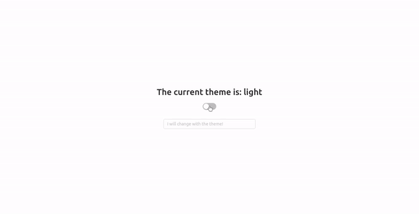
Now, we can use it like this:
Inside our playground, we will be able to change smoothly between themes!
CSS Injection Order
You may notice our styles are being appended to the head at runtime which means that those that were added at build time will be possibly overridden.
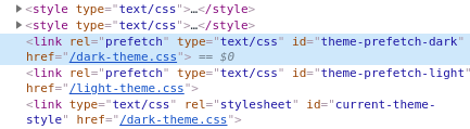
On this screenshot, you may observe that the style tags which are build-time CSS declarations are located before those pre-fetched. To avoid overriding our styles, we can mark an insertion point in our HTML which will allow it to be injected at that location, avoiding collisions. Thankfully, we don't have to implement it ourselves since react-css-theme-switcher comes with a built-in solution.
To begin, add in your HTML a comment where you want the styles to be injected. Also, the text content of this will be the identifier we will pass to the ThemeSwitcherProvider.
Finally, on the provider:
With this, we are done! If you check your developer tools:
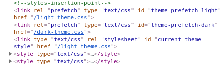
Our styles will be injected where we want them to. Now, it won't conflict with our styles!
Note: Watch out for HTML comment trim in production. Make sure your project works well in production and in development.
Conclusion
AntD is an amazing UI library which can help to create projects quickly and with a beautiful user interface. However, it has a major weakness: its styles are not easily configurable since they use Less stylesheets. Using Gulp to compile and extract AntD CSS and react-css-theme-switcher to inject and change between them, this issue could be solved in a performant way. In the future, it would be good to explore how to optimize these generated stylesheets by extracting duplicate styles and reducing fetched CSS size.
I hope you found this article useful. For more up-to-date web development content, follow me on Twitter, and Dev.to! Thanks for reading! 😎


